Abstract—With millions of apps available to smartphone users, and the ability to potentially install hundreds or even thousands of apps on one’s mobile device, new interfaces and voice control integrations are helping to make accessing these apps easier. However, it is still a necessary task to visually organize one’s apps for easier future access. On Apple iPhones, the “Edit Home Screen” function allows users to visually arrange and organize installed applications on their home screen. This study analyzes the “Edit Home Screen” interface, the contexts in which users of a wide variety of backgrounds interact with it, and explores possible alternative designs that could improve its usability.
NEEDFINDING EXECUTION 1: EDIT HOME SCREEN SURVEY
Survey responses were gathered via peersurvey.cc.gatech.edu. Participants were asked basic questions about their backgrounds, and general experience with iPhones. This was followed by prompts for data, including number of total apps installed, and number of pages, folders, and widgets on each user’s home screen.
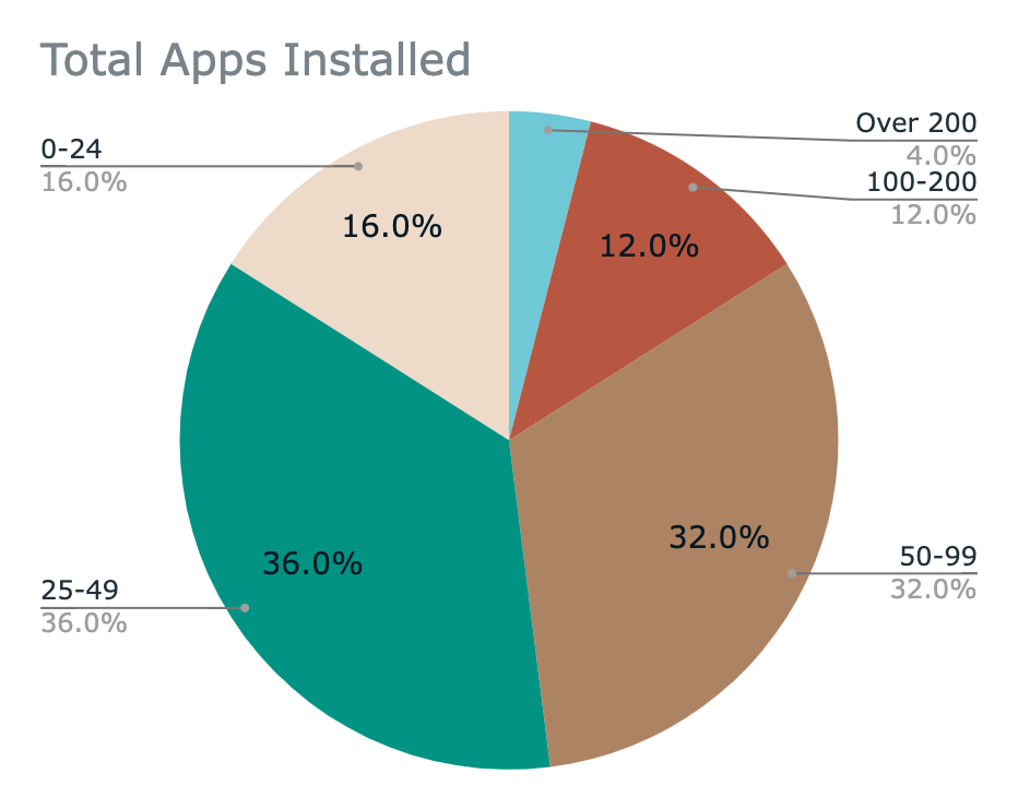
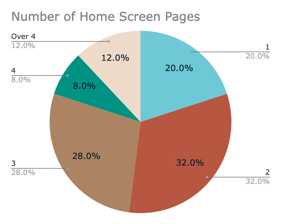
Figure 1—Left: total number of apps installed on survey users’ iPhones. Right: total number of home screen pages.
At the end of the survey, participants were asked to complete 4 home screen rearrangement tasks, and then undo them. Users then picked what they felt were the most difficult and easiest tasks, and provided short answers for what made the difficult tasks difficult, and the easy tasks easy. Please see Appendix: Survey Responses for all raw survey data.
Summary
The top three reasons why participants used the “Edit Home Screen” interface were “organization/efficiency,” they “downloaded a new app,” and they “deleted an app” (see Figure 13).
While most stated they were either “satisfied” or “neutral” when using this interface, many of these same users had difficulty with several of the app rearrangement tasks. According to responses, the most difficult tasks included completing and undoing Task 4, with Task 3 being the 3rd most difficult (see Figure 15). What made these tasks particularly hard was the need for precise movement, and accidental page turning or folder creation while dragging an app icon between pages (see Table 3). By and large, users said the easiest tasks were those that took place on the same page, using words like “intuitive,” “simple,” and “easy” in their short answers (See Figure 16 and Table 4).
Biases
To mitigate confirmation bias, I made sure to avoid leading questions. For example, not only did I ask users what they thought was difficult to do with the interface, but also what was easy. Unfortunately, it should be noted that I did not get a chance to have anyone else look over my questions before the survey was published. I would like to ensure this happens for future surveys.
Also several aspects of the survey could have been improved. For one, it could be shorter and simpler, and it would’ve been helpful to know how relevant the tasks given at the end of the survey were to the users. Next, the reliability of data from the task portion might not be completely sound, as every user had a different arrangement of app icons to begin with. It may be better to have users perform gestures with the same initial arrangement of icons in the future to isolate potentially confusing aspects of the ‘Edit Home Screen’ interface.
NEEDFINDING EXECUTION 2: INTERVIEWS
Raw Interview Results
For this needfinding plan, there were four total interviewees whose backgrounds varied across age, gender, and years of iPhone ownership. Most of the users’ iPhones had iOS version 15 installed while one had version 16. Each user was asked how they like to organize their home screen. Users were also asked to carry out the same set of tasks at the end of the survey in needfinding plan 1. All participant interviews were audio recorded.
Table 1—List of interviewees and home screen related data
| Participant | Age | Gender | iPhone usage (in years) | iOS Version | Total Apps Installed | Total Home Screen Pages | Total Folders |
| 1 | 18-29 | M | 8 | 15.5 | 17 | 1 | 1 |
| 2 | 18-29 | M | 6 | 15.6 | 58 | 2 | 1 |
| 3 | 50-64 | M | Over 10 | 15.6.1 | 76 | 5 | 0 |
| 4 | 30-39 | F | 10 | 16.0.0 | 44 | 3 | 10 |
When asked about how he likes to organize his home screen page, Participant 1 placed great emphasis on simplicity saying, “I don’t really want to be scrolling many [pages] over…It has to make sense in my logical mind.” He continued: “…because I like simplicity, I don’t like to put them in a bunch of folders[…] I want to see them all, and just have it on one screen, then I can just one click.” Participant 1 performed all rearrangement tasks quickly, without any errors. Because Participant 1 only had 1 page, he had to move an app from the first page to the second before attempting the rearrangement tasks involving 2 pages.
Participant 2 had 2 pages in total, each with empty rows between the apps at the top and the bottom row of apps, saying that he “likes having open space to swipe on the 1st page, rather than touch apps while swiping.” Page 1 for this user was mostly reserved for apps that come pre-installed on the phone, whereas page 2 was for apps that were recently downloaded. Participant 2 successfully accomplished each task, except when moving an app from page 1 to the left-most column of page 2. In that instance, Participant 2 accidentally created a folder with another app on page 2.
Participant 3 had the most apps, and the most pages, but zero folders saying “I don’t like the folders,” because “they take longer.” In his own words, page 1 was reserved for the “stuff I use all the time.” During the rearrangement portion of the interview, this user was able to accomplish the first task, but had great difficulty with all of the following ones due to accidental exiting out of ‘Edit Home Screen’ mode, and difficulty with re-entering it. Additionally, there were instances of accidental folder creation, and icons not moving when tapped and dragged. Regarding icons not moving, Participant 3 said, “See? It always does that,” and “it just won’t, it won’t move like I told it to.” “It’s very frustrating for me using this, because[…] everything you’re seeing, it happens every time.” He often asked, “what am I doing wrong?” Participant 3 was unable to carry out the undo tasks because he couldn’t remember the original positions of the apps.
Participant 4 was similar to Participant 2 in that she preferred recently downloaded apps to be kept on page 2, and empty rows on all pages. Regarding page 1: “Page 1 is for apps that come with the phone, what I need for business. My email, my files, and then my notes page, my reminders, my apple wallet, my contacts.” When moving an app from the right column to the left, and seeing the apps shift lower in the sequence of apps, the user said: “…see things like that[…] like I wouldn’t say that I feel frustrated with how that moved over, but[…] sometimes I’m just kinda like ‘Oh, I don’t love that’ because then I have to go back, and grab it again.” There were instances of accidental page-turns, and difficulties re-entering ‘Edit Home Screen’ mode, similar to Participant 3.
None of the interviewees used the app library page, accessible by swiping all the way left. One interviewee, Participant 2, used the search bar for accessing apps by swiping all the way right.
Summary and Biases
Each user initially expressed neutrality in their satisfaction with organizing their apps. However, upon completing the task portion of the interview, 3 out of 4 made errors and mentioned dissatisfaction with specific aspects of the interface by the end. Accidentally moving apps between pages, folder difficulties, and entering ‘Edit Home Screen’ mode were the most common challenges.
Overall, I made sure to be neutral in my questioning, but there could have been further mitigation of biases. I know that I dislike aspects of the ‘Edit Home Screen’ interface already, so I considered the potential for confirmation bias and observer bias beforehand. For each interview, I specifically looked out for where I was wrong, especially answers that confirmed there were not any issues with the interface. However, I did not involve anyone else to look over my interview questions. I also think my questions were sometimes asked in a different way for different interviewees. I can work to be more consistent in my questioning. Lastly, these interviews were a mix of open-ended questions, naturalistic observation, and think-aloud. Video recording will likely be superior to audio recording of such interviews in the future. There were many times I wished I was filming so that I could capture users’ specific interactions with the interface.
NEEDFINDING EXECUTION 3: PARTICIPANT OBSERVATION
Raw Observation
As I was rearranging and organizing apps on my iPhone while in a non-social context in my apartment, I noticed several unexpected things would occur at particular moments. When trying to drag an app to the right column of page 1 of my home screen, I would unintentionally turn to page 2. I found this to be disorienting, as I was only conscious of how page 1 was arranged and not page 2. This often led to either placing this app on the 2nd page in a place I didn’t want, or accidentally creating a folder with another app on the 2nd page. If I tried to bring it back to page 1, the same thing would occur in the opposite direction. Dragging icons between pages within a folder suffered from a similar effect.
When trying to insert an app icon in between two other apps, I discovered the interface was only making space for the app I was dragging when the position of my finger was precisely over the space between the two apps. This did not feel intuitive to me, I was expecting that moving the app on top of another app would immediately push that app and all the following ones out of the way. A sense of direct manipulation seemed to disappear during this interaction.
For fun, I experimented with a 2 x 2 sized widget on page 2 and noticed that, because it’s impossible to place a widget inside of a folder, moving a widget into a specific area of the page was much more intuitive than moving apps, and it required much less precise finger-dragging gestures.
Summary and Biases
As a participant observer with over 200 apps on my phone and two home screen pages, I noticed that it was much easier to create a folder than it was to insert an app between two others. I also noticed I was sometimes making errors when dragging apps around, like accidentally creating folders and turning pages. I am now curious to know the degree that users would be interested in modifications to the ‘Edit Home Screen’ control scheme. I am also curious if users would be interested in a feature wherein folders could be locked, so that it wasn’t as easy to accidentally drag an app into one. Perhaps most importantly, would users be interested in an undo feature?
Needfinding through participant observation was very insightful, as I was directly experiencing using the Edit Home Screen interface. However, I think the potential for bias was greater than I initially thought, as I was often tempted to hyperfocus on specific functions of the interface that I was primarily interested in. It might have been better to have another person observing my participation, or better yet, to learn how other users like to organize their home screens more deeply. Then, if I underwent participant observation again, I could try to organize my home screen as they would have, and see if problems or errors arise.
DATA INVENTORY
Who Are the Users?
Based on needfinding studies 1 and 2, users in this data inventory are novice and expert iPhone users who are adults ages 18 and up. Their years of experience with iPhones range from less than 1 year to 19 years of ownership. They have iOS versions 14 – 16 installed, with most using iOS 15. Novice users are those who are unfamiliar with Home Screen terminology like “folder,” “pages,” and “widgets,” and they were more likely to make errors during the task portions of the survey and interviews.
Where Are the Users?
The interviews and my participant observation noted that users’ environments ranged from indoors to outdoors, and from quiet personal spaces to public ones. More needfinding could be done to better answer this question in the future.
What Is the Context of the Task?
The context of the users are either when they are alone, or with others in the same space. There could be countless other distractions happening, like other people talking or other tasks, but overall, users engage with this task during moments of downtime, or when they have just installed or deleted an app. Like the previous question, this could be researched more.
What Are Their Goals?
In and of itself, the act of organizing apps on a home screen is not the goal of these users. Basically, they are trying to accomplish any other goal. In other words, users’ real goals are as diverse and varied as their personalities, and apps can often allow them to accomplish them. But one must first access those apps to begin with. So most users engage with organizing their apps in a way so that accessing apps can be more efficient and/or pleasant. Some users want home screens to reflect their lifestyle or personality. For instance, the user I interviewed who values simplicity, wanted to have as few apps as possible.
What Do They Need?
Users need faster and more efficient access to their apps. Navigating to an app should feel like being on autopilot – an invisible, instant process, regardless of context. To do this they need an easy to understand home screen, and an even easier to understand method of organizing their apps. They need the process of organizing apps to be intuitive, easy to learn, and lead to as few errors as possible. User frustration in the interviews was a clear sign that expectations in this area were not being met somehow.
What Are Their Tasks?
In order to accomplish their goals, users are thinking through how they prefer to organize their apps. They are thinking about where to organize an app they just installed, or which apps they should delete. Then they might decide to act on those thoughts. Physically, they may be standing, sitting, or walking. They may be trying to socialize or listen to others while arranging their apps. The interview needfinding was helpful in answering this question as well.
What Are Their Subtasks?
Subtasks include entering into the mode that allows them to organize their apps, moving apps to desired locations, adding them or removing them from folders or pages, and deleting apps. They also need to be able to exit the editing mode.
DEFINING REQUIREMENTS
Based on the data inventory, a successful redesign of the ‘Edit Home Screen’ interface will meet the following set of requirements. First, it must be usable for novice iPhone users. This is defined by lower recorded instances of errors such as accidental page-turning, folder creation, misplacement, and exiting from the interface while dragging an app around during naturalistic observation.
Functionality-wise, the interface must continue to allow the user to organize apps on their home screen using the current model of a 4 x 6 grid of icons and another row of 4 apps at the bottom. Folders, and pages may be added if the user wishes. This is not an overhauled redesign of the iOS home screen after all, but solely the ‘Edit Home Screen’ interface.
Lastly, the interface must continue to be compatible with all iPhones that can successfully run iOS 14 and up. Prototypes may not utilize more than the built-in haptic, auditory, and visual feedback mediums that iPhones provide.
CONTINUED NEEDFINDING
Many new questions have arisen based on initial needfinding data. As mentioned before, I am curious if users would be interested in an ‘undo’ feature while arranging apps, or a feature that prevents users from accidentally adding an app to a folder or a different page. This could be asked in another survey.
There also remain questions related to the data inventory, which could be answered through interviews. For instance, more questions regarding who the users are, and their environment. How can I better define what a novice or expert iPhone user is? Are there different types of novice users? Are novice users’ needs and goals regarding app organization the same as experts’?
Lastly, gathering data on specific user home screen organization behavior when one installs a new app would be useful when developing possible prototypes. Think-aloud and naturalistic observation will be particularly useful in this case.
APPENDIX: SURVEY RESPONSES
Table 2—Survey data of users’ backgrounds, years of experience with iPhones, and home screen related data.
| Response | Age | Gender | iPhone Exp. (yrs.) | iOS Version | # of Apps Installed | Freq. of ‘Edit Home Screen’ Use | # of Pages |
| 1 | 30 – 39 | M | 6 – 9 | iOS 16 | 50-99 | A few times a year | 3 |
| 2 | 18 – 29 | F | 3 – 5 | iOS 15 | 50-99 | A few times a year | 3 |
| 3 | 18 – 29 | M | 6 – 9 | iOS 15 | 50-99 | Once every several years | 1 |
| 4 | 30 – 39 | M | 6 – 9 | iOS 16 | 50-99 | A few times a year | 2 |
| 5 | 30 – 39 | F | 6 – 9 | iOS 14 | 0-24 | A few times a year | 2 |
| 6 | 30 – 39 | M | 6 – 9 | iOS 15 | 50-99 | Once a year | 2 |
| 7 | 30 – 39 | F | 6 – 9 | iOS 15 | 50-99 | A few times a year | 4 |
| 8 | 18 – 29 | Non-Binary/ Other | 6 – 9 | iOS 15 | 50-99 | A few times a year | 1 |
| 9 | 18 – 29 | Non-Binary/Other | 3 – 5 | iOS 15 | 25-49 | A few times a year | 1 |
| 10 | 18 – 29 | M | 6 – 9 | iOS 15 | 25-49 | A few times a year | 3 |
| 11 | 40 – 49 | M | 6 – 9 | iOS 15 | 25-49 | Once a year | 3 |
| 12 | 18 – 29 | F | 6 – 9 | iOS 16 | 25-49 | Once a month | more than 4 |
| 13 | 30 – 39 | M | 3 – 5 | iOS 16 | 25-49 | Once every several years | more than 4 |
| 14 | 18 – 29 | F | 6 – 9 | iOS 16 | 25-49 | Once a year | 2 |
| 15 | 30 – 39 | M | 1 – 2 | iOS 15 | 25-49 | A few times a year | 2 |
| 16 | 50 – 64 | F | 10-19 | iOS 15 | 0-24 | Once every several years | 3 |
| 17 | 18 – 29 | M | 6 – 9 | iOS 15 | 0-24 | A few times a year | 2 |
| 18 | 50 – 64 | M | 10-19 | iOS 16 | Over 200 | A few times a year | more than 4 |
| 19 | 40 – 49 | M | 10-19 | iOS 15 | 100-200 | Once every several years | 4 |
| 20 | 30 – 39 | M | 6 – 9 | iOS 15 | 100-200 | A few times a year | 2 |
| 21 | 30 – 39 | F | 6 – 9 | iOS 14 | 25-49 | A few times a year | 2 |
| 22 | 18 – 29 | M | 6 – 9 | iOS 16 | 50-99 | A few times a year | 1 |
| 23 | 30 – 39 | F | 6 – 9 | iOS 16 | 0-24 | A few times a year | 3 |
| 24 | 40 – 49 | F | 10-19 | iOS 15 | 100-200 | A few times a year | 3 |
| 25 | 30 – 39 | M | 10-19 | iOS 15 | 25-49 | Only once, and haven’t rearranged it since | 1 |
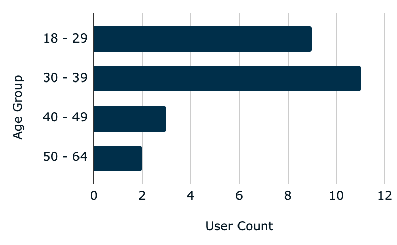
Figure 2—User Age groups quantities.

Figure 3—User Genders.
Figure 4—Number of years users have had an iPhone.
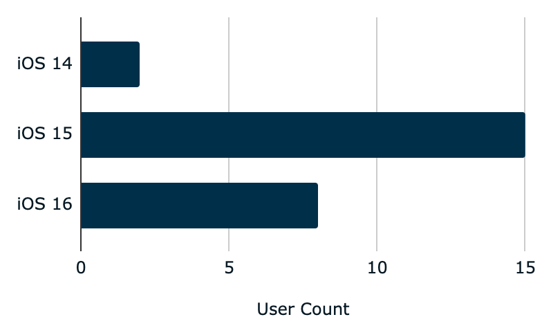
Figure 5—Breakdown of iOS versions installed on survey participants’ iPhones.

Figure 6—Users’ total number of installed apps on their iPhones.
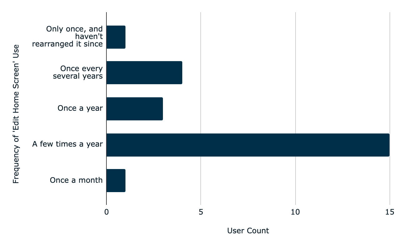
Figure 7—Frequency of ‘Edit Home Screen’ functionality usage.

Figure 8—Total number of pages on users’ home screens.
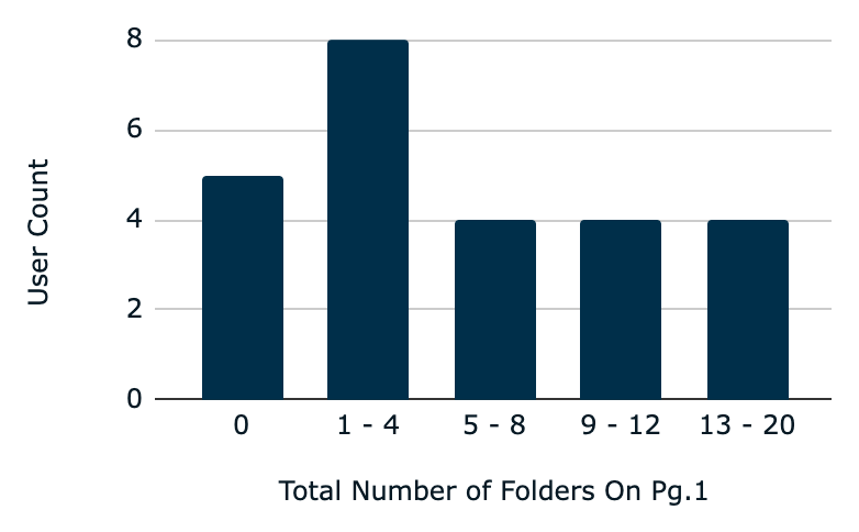
Figure 9—Total number of folders that users have on page one of their home screens
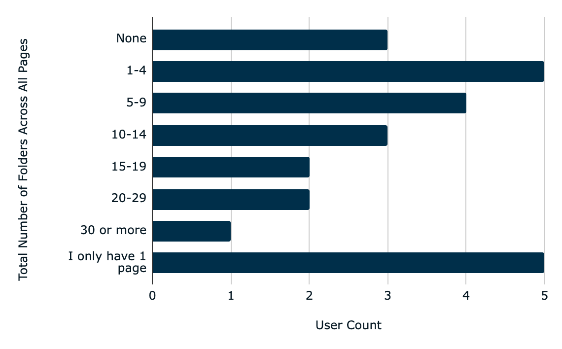
Figure 10—Total number of folders users have across all pages of their home screens.
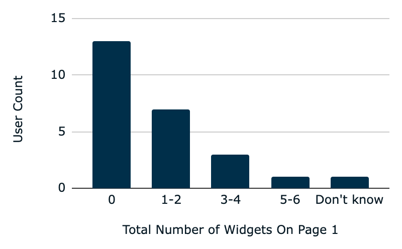
Figure 11—Total number of widgets users have on page 1
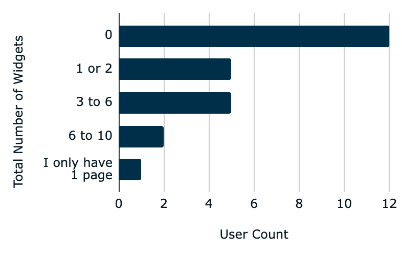
Figure 12—Total number of widgets users have across all pages of their home screens.
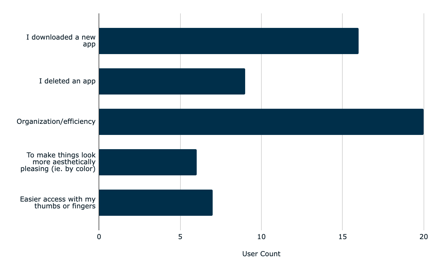
Figure 13—Users’ reason(s) for editing their home screens.
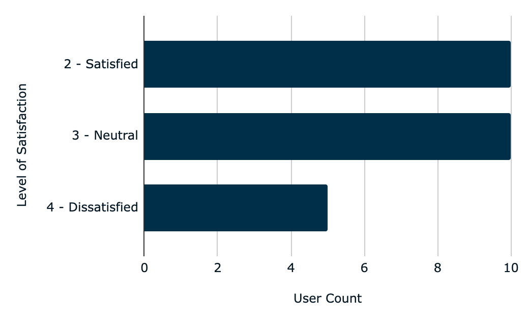
Figure 14—User level of satisfaction with the ‘Edit Home Screen’ interface
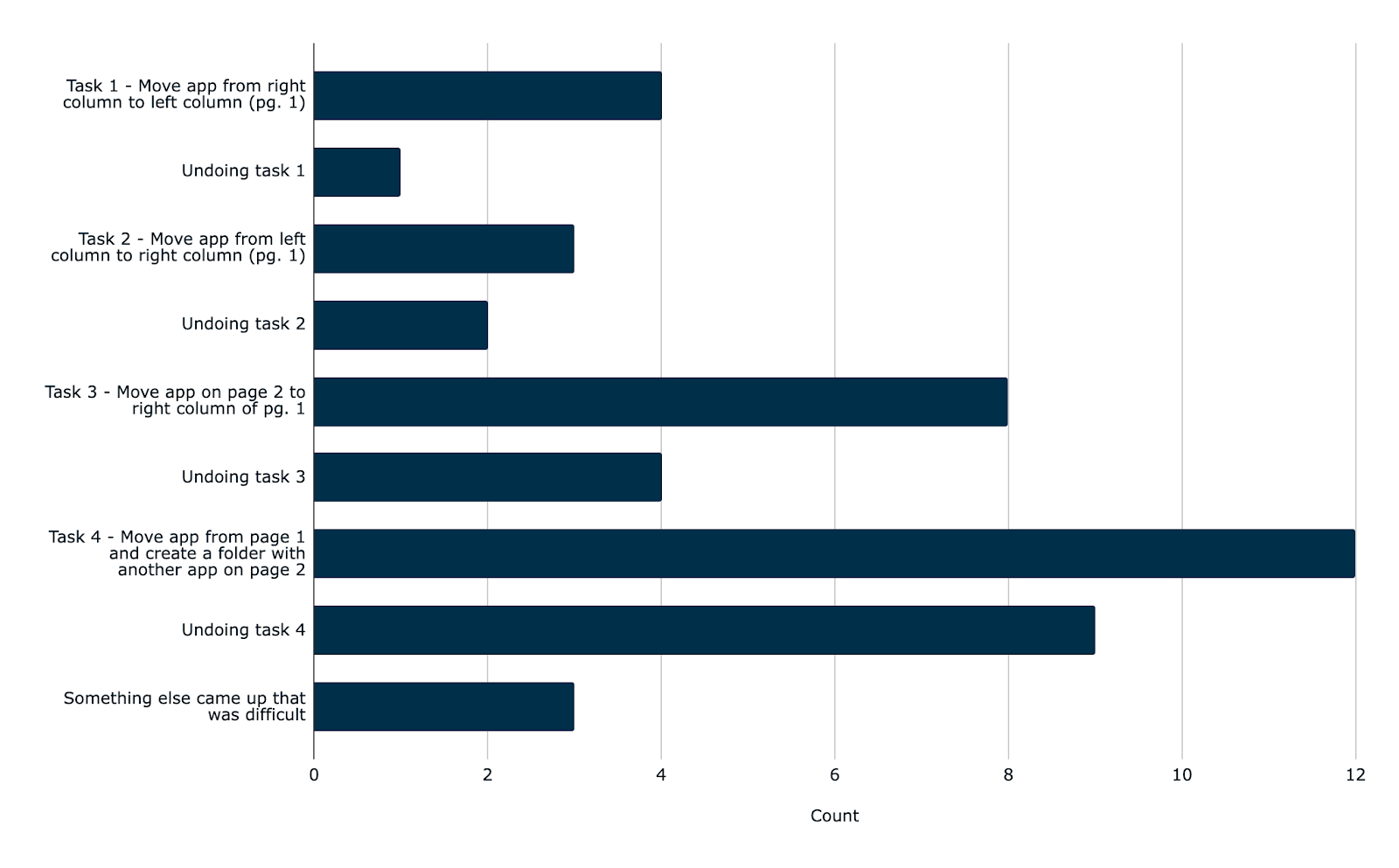
Figure 15—Tasks that survey participants said were the most difficult to accomplish.
Table 3—User descriptions of what made those tasks difficult
| Response | Description of Difficulty |
| 1 | N/A |
| 2 | App doesn’t transition easily across multiple pages. |
| 3 | It doesn’t feel intuitive how going from one page to the other works |
| 4 | Moving apps across pages is clunky, easy to lose contact with app and strand it in a random place |
| 5 | I don’t know how to “undo” or “reset.” Only know how to do this manually. |
| 6 | Space on screen has to be just right to move pages |
| 7 | All apps start moving and it feels stuck on the edge of the page. |
| 8 | Apps move/slide to the row below, making it hard to place the app I’m moving in the correct spot |
| 9 | Time |
| 10 | I don’t like change. |
| 11 | Had to get the icon in just the right spot |
| 12 | Sometimes an app from the row below would slide into position and cause me make a folder instead of simply moving it. |
| 13 | Creating a folder is kind of hard |
| 14 | This was my first time performing this task |
| 15 | Narrow margin to get the page to flip |
| 16 | I didn’t know how to do it and it wasn’t intuitive |
| 17 | Touch feels very sensitive and keep making errors |
| 18 | Apple seems to put a “time delay” to make sure that’s what you want to do I guess. Folders are a nightmare. |
| 19 | It was easy |
| 20 | The imprecision of moving apps between pages, and the multiple steps of sorting them in the new folder |
| 21 | . |
| 22 | Slowness of interface |
| 23 | Holding Ivón down & sliding over |
| 24 | Hard to control where to move it when crossing pages – usually go too far or not far enough and it rearranges the other apps unintentionally |
| 25 | Folder slightly finnicky |
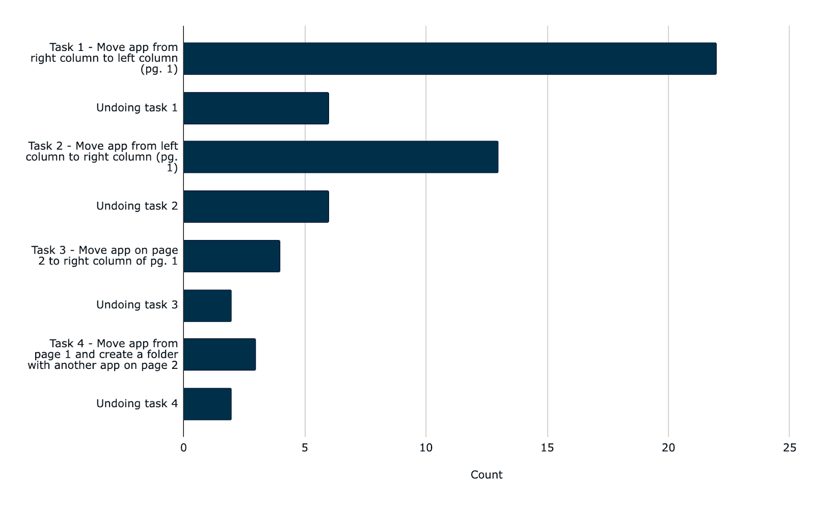
Figure 16—Tasks that survey participants said were the easiest/simplest to accomplish.
Table 4—User descriptions of what made the easiest/simplest tasks easy.
| Response | Description of Difficulty |
| 1 | N/A |
| 2 | No issues with moving apps. |
| 3 | This felt intuitive how each app could just be dragged to the new location |
| 4 | Moving apps on the same page is straightforward, since total movement of finger is small |
| 5 | Because I do these tasks regularly. |
| 6 | Just simple |
| 7 | It didn’t get stuck but it made the rest off the app which is annoying |
| 8 | Apps would move the way I intended |
| 9 | Time |
| 10 | I like things the way they were. |
| 11 | There was less precision required in movements |
| 12 | Similar gestures to ‘undo’ (especially when creating/undo folder creation). |
| 13 | Feels like you are directly manipulating the app |
| 14 | I have performed these tasks before |
| 15 | Intuitive |
| 16 | It was simple and intuitive |
| 17 | Worked easily. Tons of user feedback |
| 18 | Its been the same process since the beginning, so I know it well. |
| 19 | Moving it |
| 20 | The linear horizontal move doesn’t upset the existing organization and is fairly easy to control. It does get messy if you try to move things between rows though. |
| 21 | . |
| 22 | Easy to use interface |
| 23 | It was just a matter of sliding an icon |
| 24 | Not moving it across another page so easier to control |
| 25 | One motion |