
Abstract—With millions of apps available to smartphone users, and the ability to potentially install hundreds or even thousands of apps on one’s mobile device, new interfaces and voice control integrations are helping to make accessing these apps easier. However, it is still a necessary task to visually organize one’s apps for easier future access. On Apple iPhones, the “Edit Home Screen” function allows users to visually arrange and organize installed applications on their home screen. This study analyzes the “Edit Home Screen” interface, the contexts in which users of a wide variety of backgrounds interact with it, and explores possible alternative designs that could improve its usability.
1 BRAINSTORMING PLAN
Overall, the goal of brainstorming will be to develop at least 20 initial ideas that might lead to 3 different prototypes of design alternatives for the iPhone “Edit Home Screen” interface. Brainstorming will be done individually to bypass complications that may arise from group brainstorming, such as conformity and production blocking. The session will take place within a few hours, and will be interspersed with several breaks for moving around. The ideas themselves will be written using pen and paper, and each will only be a few words long. Some ideas might be smaller components of an interface to be combined later on, while others will be more big-picture. At least three of these ideas will utilize non-traditional means of control. Lastly, the core problem will be written prominently at the top of the page.
2 BRAINSTORMING EXECUTION
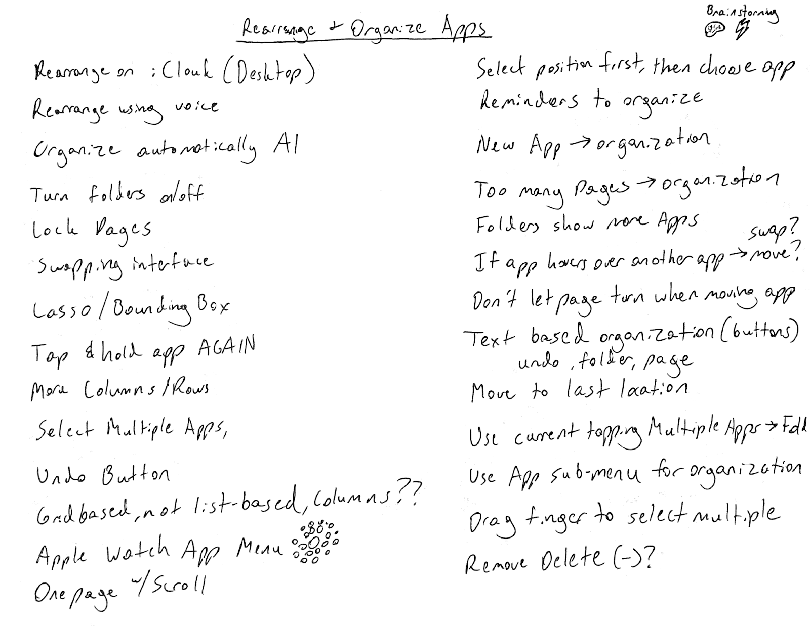
Figure 2.1—Paper from individual brainstorming session.
Individual brainstorming was a success overall with 27 total ideas recorded. Three of the ideas “rearrange using voice,” “organize automatically with AI,” and “text based organization,” utilized non-traditional forms of control in this context. Most of the written ideas were smaller components that can be added to or swapped out with features within the current interface. Additionally, several of the generated ideas could easily branch off into other ideas.
3 SELECTION CRITERIA
Each of the three design alternatives of the “Edit Home Screen” interface must cater to novice iPhone users, aim to achieve lower recorded instances of user error, be compatible with iPhone hardware, and not change the existing arrangement of apps and folders within a 4 x 6 grid with another row at the bottom. These requirements were mentioned within the defining requirements section of the previous M2 document.
The majority of the ideas generated during brainstorming were small features that can be tested individually, so they will be combined for different prototypes. However, this must be done so that one brainstorming idea does not conflict with or negate another idea. While Apple may have tried to make editing the home screen as simple and easy to do as possible, it is nonetheless a very complex system of interconnected functions, and a small change to one aspect of the control scheme can potentially affect other aspects or even mess up the whole system. This must be taken into account for all prototypes. In this regard, multiple levels of fidelity with a bottom-up approach will be pursued. In other words, individual aspects of the prototype interfaces will be emphasized first.
Because design alternatives must be compatible with iPhone hardware, which is mobile and touchscreen based, verbal, card, wireframe, and/or Wizard of Oz prototypes will be ideal. Ideas such as “Apple Watch menu,” and ones that are overly long and complicated will not make it to the prototyping phase due to the 4 x 6 grid, and novice iPhone user requirements, respectively.
4 CARD PROTOTYPE
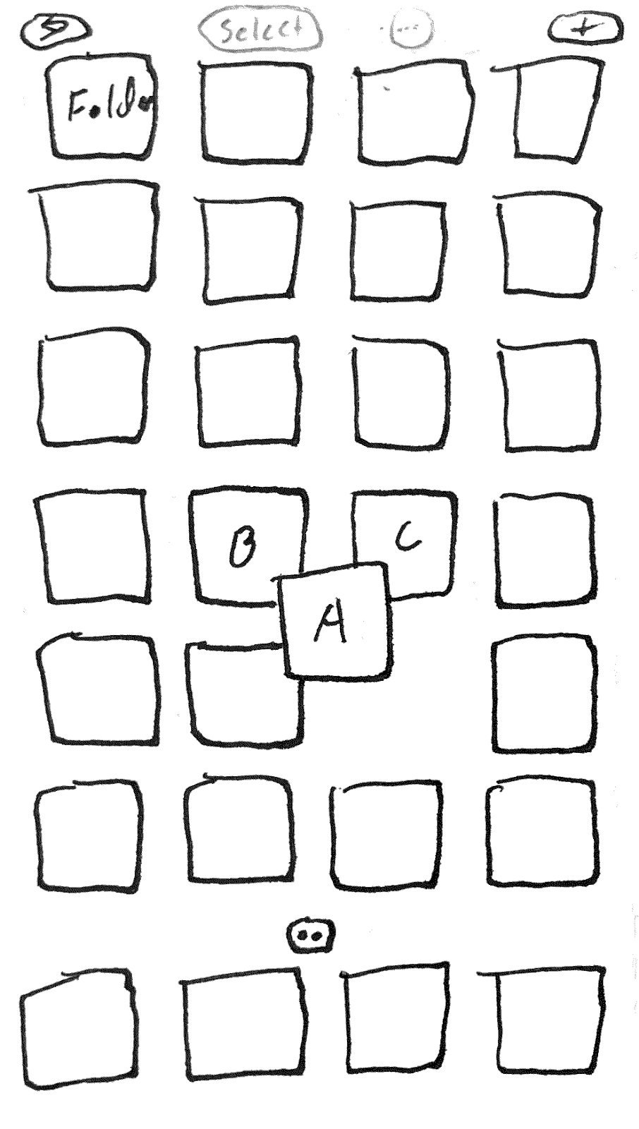
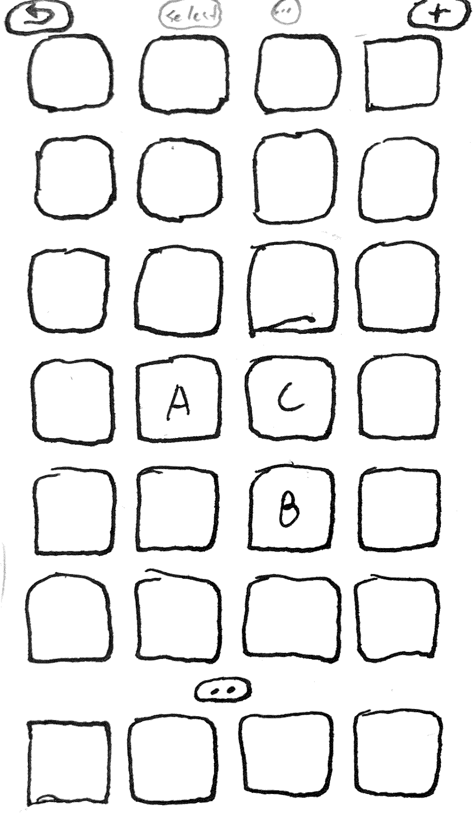

Figure 4.1—Three cards from the card prototype. Left and middle: dragging an item swaps positions with another item. Right: selecting multiple items similar to Apple Photos select function.
4.1 Description
The card prototype will be made up of several cards that will simulate several different actions that are not available in the current “Edit Home Screen” interface. Please see Appendix: Card Prototype for images and descriptions of all cards in the prototype.
First, there will be a card that describes how the user might enter “Edit Home Screen” mode (see figure 7.1). This way is no different from how it is currently done in iOS 16. One other way is to tap and hold on an empty area of the home screen. Next, there will be a set of three cards that describe how apps could be arranged via swapping positions. Instead of automatically creating a folder when dragging an app over another, app positions will be swapped. The original intention of this is to reduce user disorientation that occasionally occurs when all apps slide down a position when an app is inserted at a position further up the list (figure 7.2).
Third, there is a card that shows the submenu that is revealed when a user taps and holds down on an item while “Edit Home Screen” is enabled. This is currently not possible in iOS 16. The functionality within this submenu will be specifically intended to organize apps more efficiently and is subject to change. Current functions include “Create Folder,” which encloses the selected app in a folder, and “Move to Page,” which can allow the user to move the app between pages in the current page select view (figure 7.3). After this, there is another set of three cards (figure 7.4) that describe what happens when the user taps the “Select” button while “Edit Home Screen” mode is enabled. Much of this functionality is consistent with how the Apple Photos app allows users to select multiple photos, with some slight modifications. This will potentially allow users to more easily organize multiple apps into folders or other pages.
Now the final card shows the submenu that would appear when the user taps the “…” button at the top of the screen when “Edit Home Screen” mode is enabled (figure 7.5). Possible submenu options are subject to change, but may allow the user to change how rearrangement behavior works, or to access auto-organizing functionality. For instance the user could change the app arrangement from the original way to “swapping.” This card is left open-ended so that feedback, functionality, or other ideas could be gleaned from users.
4.2 Evaluation
Ultimately, the card prototype addresses all requirements that were defined in assignment M2. The interface provides constraints to help prevent user errors and slips. Though we will see if users become frustrated that moving apps to other pages is no longer possible. Even so, the prototype can easily be amended to allow this functionality again, perhaps with more clear indicators like in the verbal prototype described below. This could be a brightening line of color on the side of the screen when the user is dragging an app to another page. Specifically, it is now necessary to tap and hold apps while in “Edit Home Screen” mode in order to remove them. This is also the case for moving apps to other pages, however this is not what I am personally used to, so I will need to consider confirmation bias when having users test this prototype. Finally, there is now a clearly labeled and visible “Select” button, that is similar to the Apple Photos app “Select” in terms of functionality. This utilizes consistency to further aid iPhone novices, and will hopefully lead to less confusion when arranging apps. Last but not least, the 4 x 6 grid format is undisturbed.
5 VERBAL PROTOTYPE WITH PHYSICAL ITEM
5.1 Description
For this prototype, I will verbally describe to users the interface and what happens when certain actions are done while “Edit Home Screen” mode is enabled. In this mode, there will be an “Undo” button at the top left of the screen – this is the same as the card prototype, however the rest of the functions will be different. Next to this button at the top-center of the screen is the original button with a “+” symbol which allows the user to add a widget. To the right of this button are two buttons. The first of the two is labeled with what looks like a dotted box, and the second says “…”
When an app is dragged and is touching either the left or right edges of the page on the home screen, a solid blue line about 1/16” thick will show and gradually become brighter and brighter. Then, the line will blink briefly signaling that the page is about to turn. In this prototype, apps can be placed anywhere within the 4 x 6 grid. Now you can have apps in separate corners of a home screen page for example. When an app is dragged and overlaps another, the other apps will slide over as they typically do in the current home screen editing interface. However, because empty spots are allowed, the apps will slide over to fill in any extra spaces further down the order of the list.
The button with the dotted box symbol is a bounding box tool. This allows the user to tap and drag a box around several apps within the home screen. Once pressed, the top of the screen will say “Tap and drag to select,” and there will also be a “Cancel” button on the top right. When the user begins doing this, the top of the screen will monitor how many apps are within the user’s bounding box selection. When the user makes their selection and releases their finger, they will then be able to drag the selected apps into folders, other areas of the page, or other pages. They can also hit “Cancel” or tap anywhere else outside of the selected apps to deselect them.
5.2 Evaluation
This prototype addresses most of the M2 requirements, particularly not disturbing the 4 x 6 grid, and being usable by novices and compatible with iPhone hardware. It is unclear if this will lead to fewer recorded instances of errors or slips. Certain changes will be welcome such as the brightening blue line that appears when apps are dragged towards the sides of a page. However, it is likely that the prototype might be complicated and hard to comprehend by users due to its auditory nature.
6 WIZARD OF OZ PROTOTYPE
6.1 Description
The Wizard of Oz prototype will primarily explore how users could organize or rearrange their home screen using Siri, or voice control. In this prototype, I will narrate how the user might enter “Edit Home Screen” mode. Then, I will narrate what happens when the user enables this mode for the first time since updating their iOS to the version that contains this voice control functionality. The user will first be visually notified that they can say things to Siri such as “Hey Siri, help me organize my home screen.”
Then, pretending to be Siri, I will say “Ok, how would you like me to organize your home screen?” I will narrate and describe how the iPhone screen will show responses the user could give such as “Sort apps by color,” “Sort by how often I use them,” “Move apps to a folder,” or “Just tidy it up.”
When the user responds with one of the choices aside from “Move apps to a folder,” I will respond with “Ok, here is a preview of what your home screen will look like. Are you sure you want me to make this change?” I will describe at this moment that the iPhone displays a visual preview of the current page, and the user will be able to swipe to check the other pages. If the user responds “yes,” I will say the changes have been made, but they can ask Siri to undo those changes if they wish.
When the user asks Siri to “Move apps to a folder,” I will respond: “Ok, which app or apps would you like me to move?” When they respond either by voice tapping and selecting apps on the page, I will say: ”Ok, where would you like me to move these to?” Users can then say the name of the folder followed by the word “folder,” or tap on the folder they wish to move the selected apps to.
6.2 Evaluation
Overall, the Wizard of Oz prototype addresses most of the M2 requirements, but similarly to the verbal prototype, it also may suffer when lowering the recorded number of errors and slips. Voice control will have its benefits and limitations based on context. It may be especially useful for novices, or users who have health limitations, or find it difficult to see the changes they are making using the visual “Edit Home Screen” interface. On the other hand, if users attempt to rearrange the home screen using voice control while in a noisy environment, this could lead to frustrating outcomes, and a less than pleasant user experience. At the possible cost of speed of the interaction overall, this prototype will need to provide those important questions asking users if they are sure they wish to continue, with their changes. Nonetheless, this prototype could lead to fascinating other possibilities, especially in the area of decent auto-organizing functionality.
7 APPENDIX: CARD PROTOTYPE
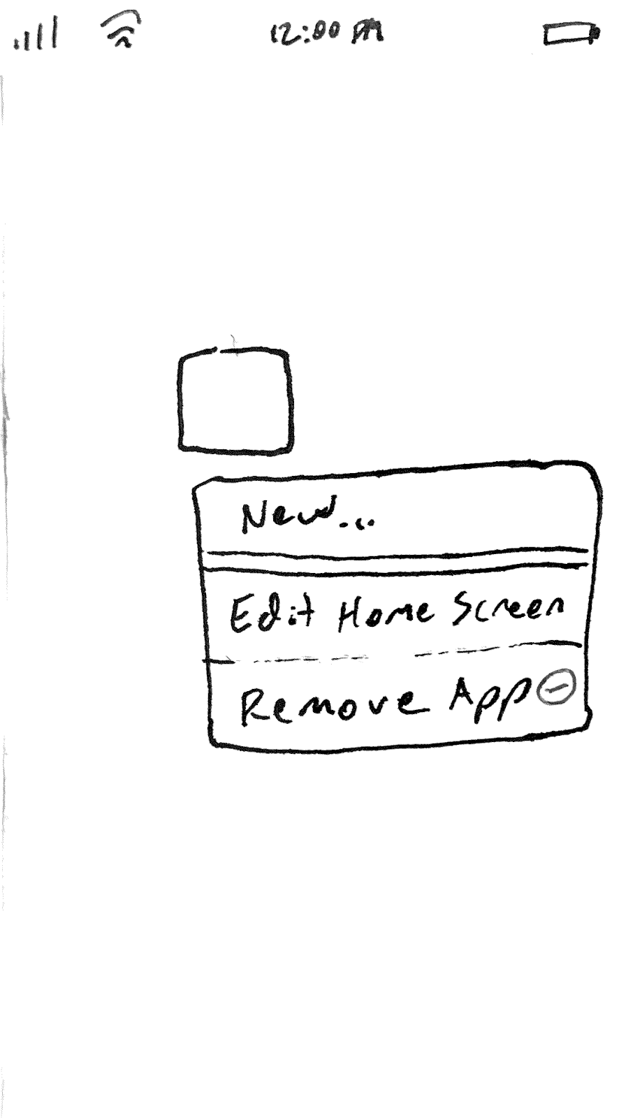
Figure 7.1—Card showing how to enter into ‘Edit Home Screen’ mode after tapping and holding down on an app icon.
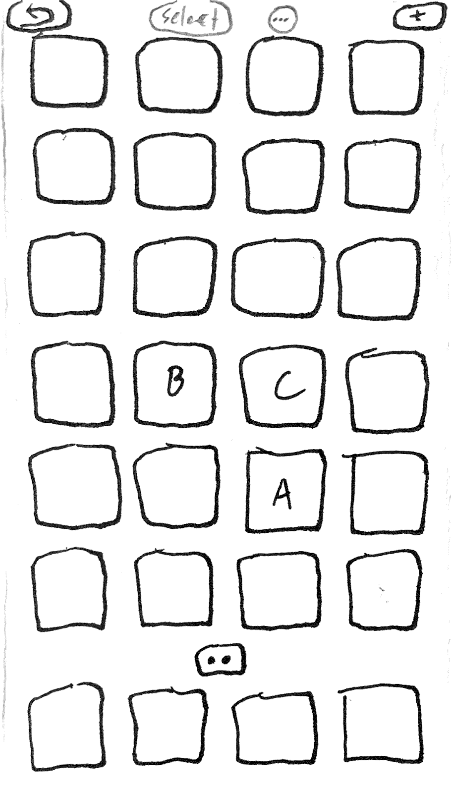


Figure 7.2—Three cards that describe how apps could be arranged via swapping positions. In this instance, dragging an app over another does not automatically create a folder.
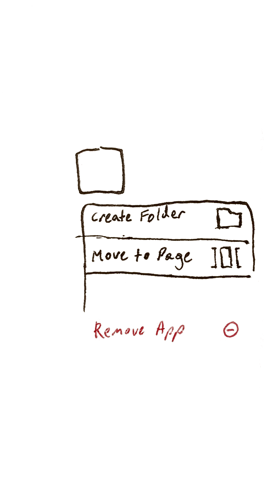
Figure 7.3—Card showing how apps can be tapped and held down again while “Edit Home Screen” mode is enabled. This reveals functionality specifically for organizing an app more efficiently.
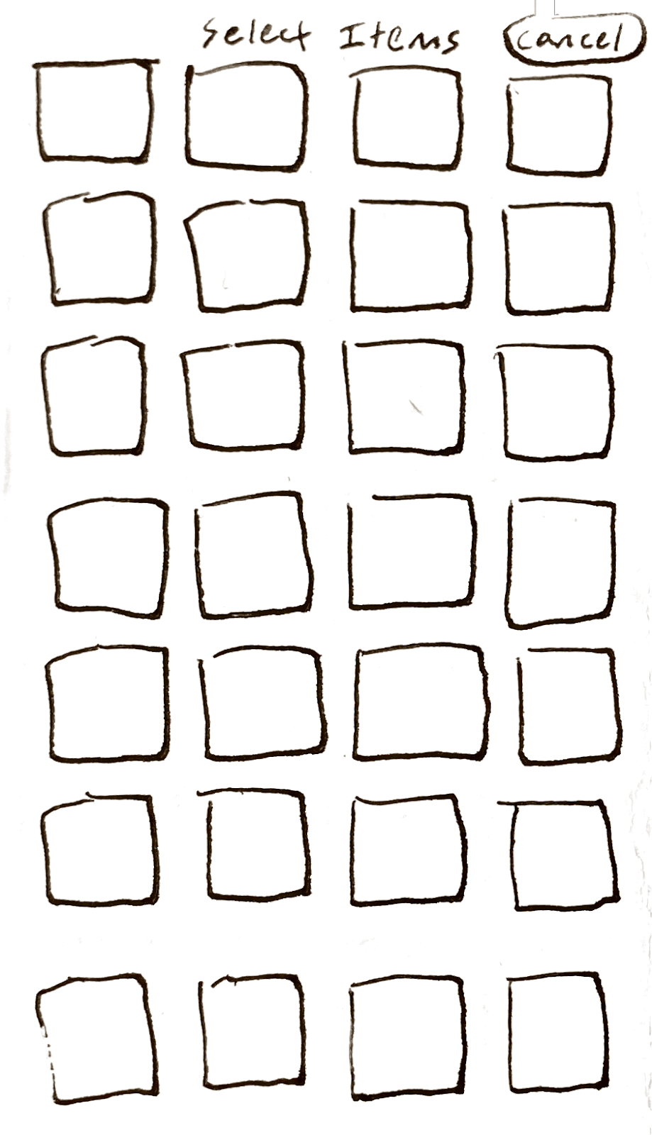
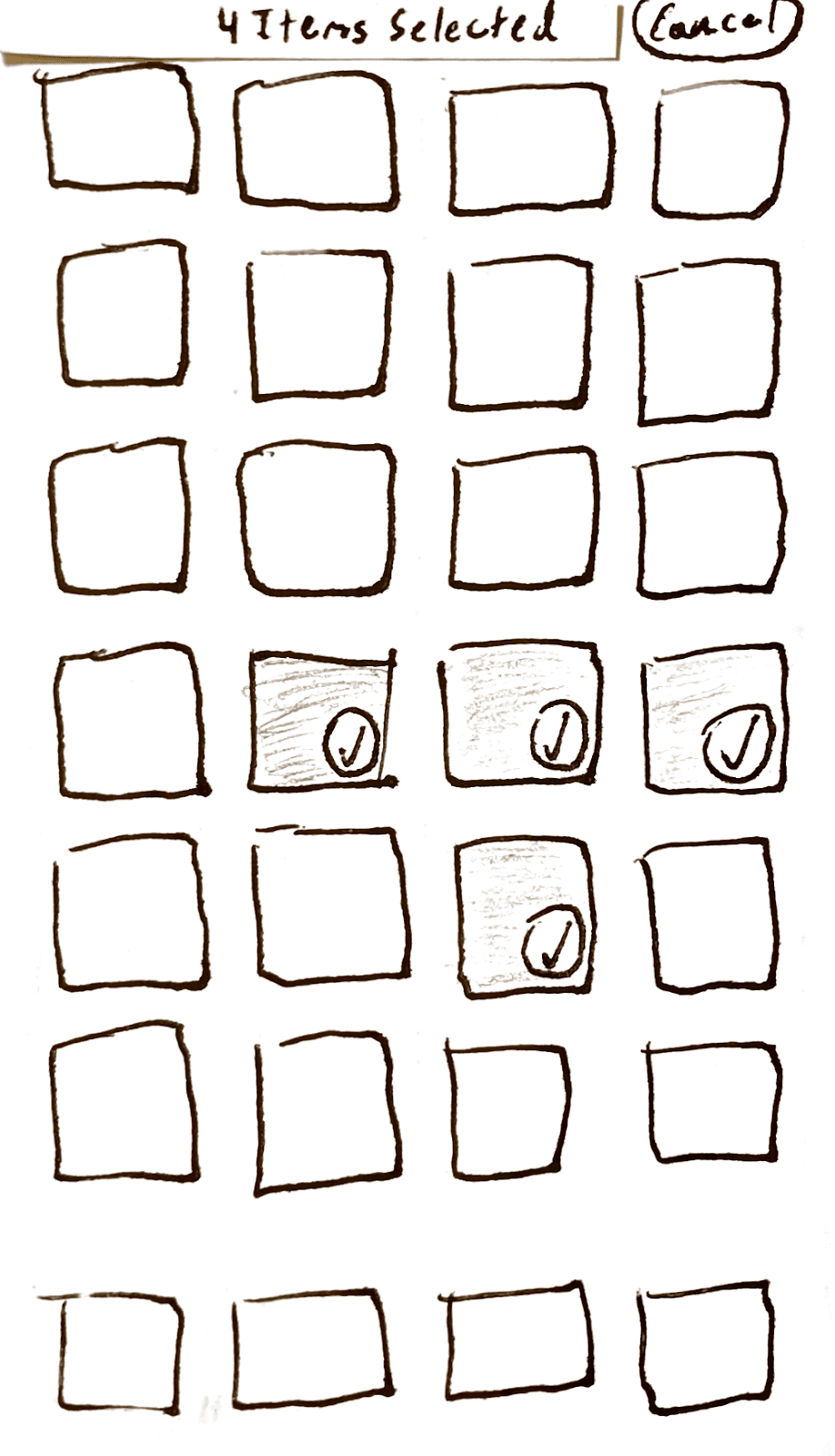
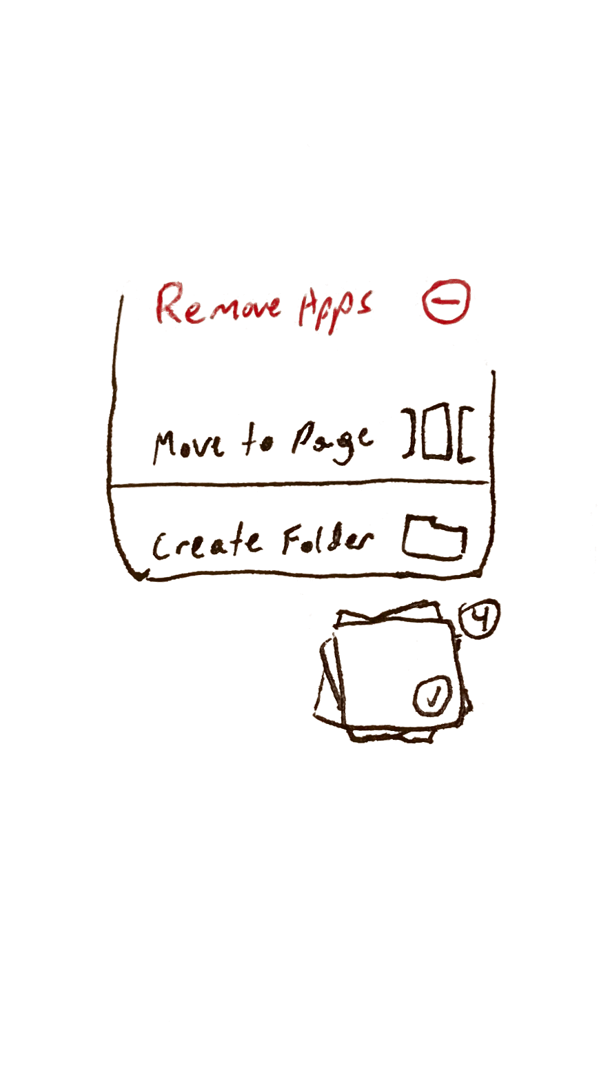
Figure 7.4—Three cards that describe what happens when the user taps the “Select” button while “Edit Home Screen” mode is enabled.
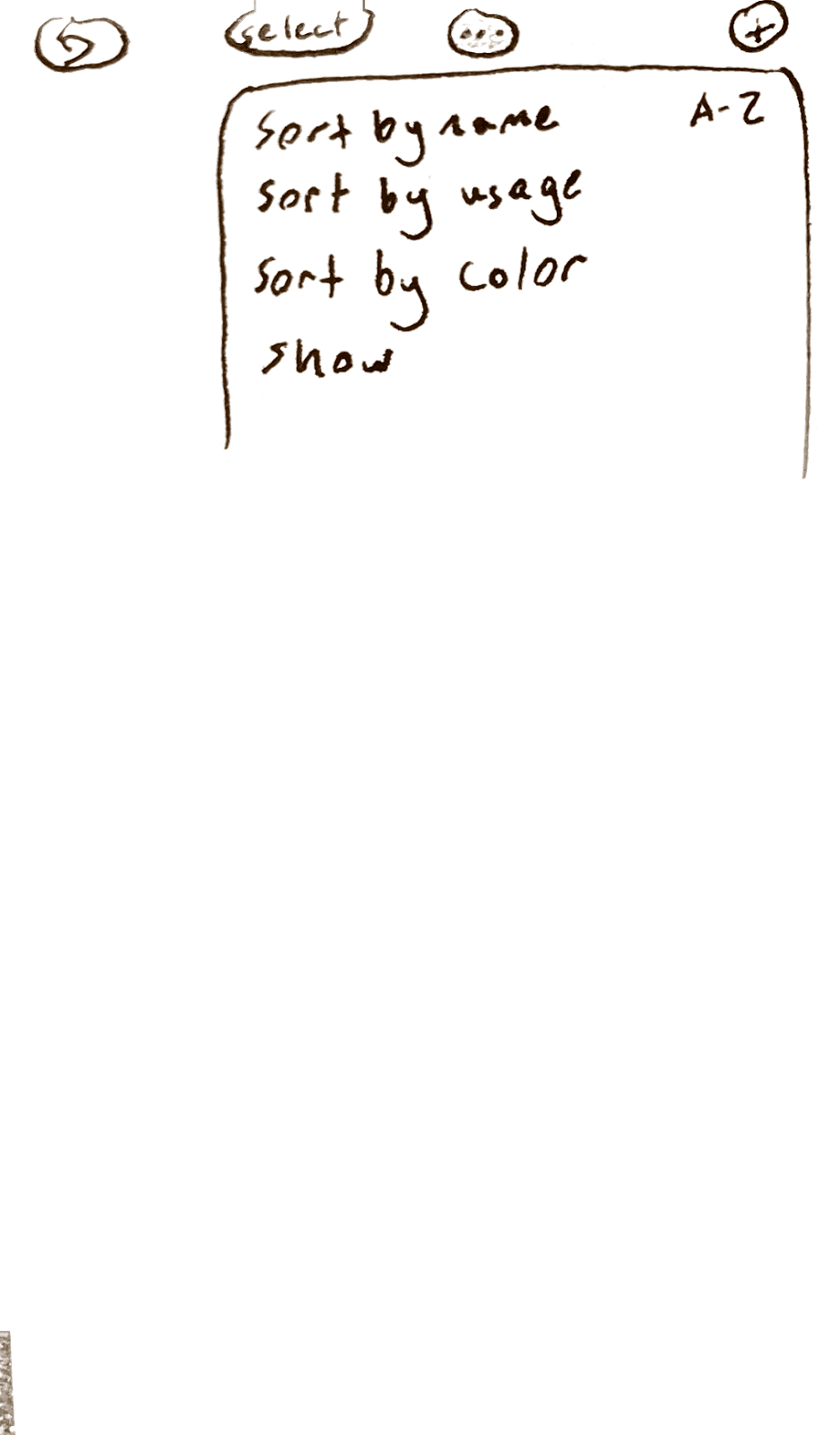
Figure 7.5—Card showing a submenu that appears when the “…” button is pressed while in “Edit Home Screen” mode. Possible options are subject to change, but may allow the user to change how rearrangement behavior works, or to access auto-organizing functionality.