1 INTRODUCTION
Flat: Music Score & Tab Editor is a cross-platform web application that is used for composing and arranging music notation. Released in 2014, it allows for real-time, online collaboration between multiple users working on the same music score, and offers a wide variety of web-based virtual instruments. Flat can be opened as a web application in a desktop browser, and can also be downloaded as a standalone app for iOS and Android tablets or smartphones. The mobile app includes most of the same features as the web app on a desktop browser. However, it is laid out quite differently due to the smaller screen. This project explores relevant information regarding current and potential users of the smartphone version of Flat, in order to provide a redesigned version of the interface responsible for inputting notes into the music score.
1.1 Interface Description
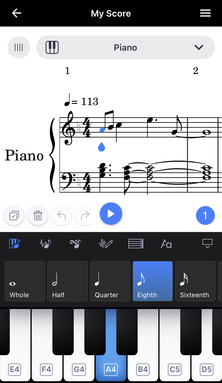
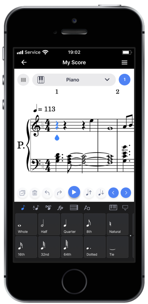
Figure 1—An enlarged view of the current note input interface of the smartphone app version of Flat.
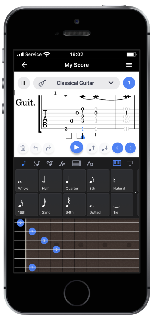
The specific interface to be redesigned for this project is the smartphone version of Flat’s note input interface. The note input interface is used to enter or remove a note at the selected point in time along an instrument’s part within a music score. It allows the user to specify a note’s length and pitch, and is the first of six interfaces that are accessible via a navbar at the top of the minimizable portion of the screen located below the music score display. The note input interface currently contains a long, horizontally scrollable row of 30 square buttons, each of which represents a different function related to note length and pitch, as well as a visual representation of a piano keyboard. This virtual keyboard is used to toggle corresponding notes at the specific moment in time designated by a blue pointer in the above music score. If the selected instrument is a drum kit or other percussion instrument, the keyboard representation is replaced by a grid of drum pads. If it is a plucked string instrument like a guitar, bass guitar, or ukulele, and a tablature staff is present, it is replaced with a six-string guitar interface.
1.2 Accessing the Interface
To access the note input interface, one must download the Flat app onto their iPhone or Android, using the Apple App Store or Google Play, respectively. Then, they must open the app, create an account or login, open a new score with the desired instruments, and tap a point along an instrument’s horizontal staff that they wish to add notes to. The note input interface is displayed by selecting the first navbar item at the top left of the bottom portion of the screen. This navbar item is represented by a piano symbol with an eighth note overlaid on top. As previously mentioned, there are five other items to the right of the note input interface icon within the navbar. They allow the user to access musical functions related to the articulations of notes, note ornamentation, dynamics, measure-specific properties, and text markings and annotations of the score, in that order. These items and their associated interfaces will be outside the scope of this project.
1.3 The Problem Space
In general, there are numerous methods, and variations of those methods, for capturing and communicating musical ideas. These can include using an audio recording app on one’s phone, scrawling musical or lyrical ideas on a napkin, verbally communicating musical ideas to a fellow musician within an ensemble, or converting one’s live musical performance into data with a music controller device connected to software. Particularly in Western music traditions, sheet music has a centuries-long history of usage for efficiently storing and communicating musical ideas for the purpose of musical performance. Even with the increasing prevalence of modern music production software in contemporary music in the 21st century–which often do not include notation functionality–ensemble musicians who learn to play an instrument are still taught to read sheet music. Music notation programs are a digital extension of the history of sheet music, and can provide the same context-specific advantages, with the added power and flexibility that computing technology provides. For instance, notation software allows a user to compose musical works to an extent limited only by their compositional skill, and the limitations of the software. It is not their technical proficiency on any physical musical instrument, which limits them. Also, music notation software allows users to complete music scores without needing to write notation by hand, and to hear their work played back to them as it is being composed. However, if music notation software is difficult to use, this could completely derail the task of capturing a musical idea, let alone preparing a music score to be performed.
For this study, the target domain will be the note input interface of the Flat app as it appears on smartphones. Beyond this, the scope of the problem space will include a fairly broad set of contexts and environments. This is due to the fact that the need to capture musical ideas could strike at any moment, and Flat being on a smartphone allows for extra flexibility and portability. The problem space will include situations where a user wishes to capture a musical idea, and/or prepare sheet music for other musicians to perform. It will also include environments with fewer distractions in which the user is away from their desktop computer in their home, out in public, or during periods of downtime elsewhere.
1.4 User Types
Users who are 18 and up will be the primary focus of this study. Additionally, users will be defined as those who have previously read sheet music for music performance purposes, used music notation software, composed music, and/or prepared sheet music for other musicians in an ensemble setting. Skill levels in each of these areas are expected to be quite varied. Nonetheless, users both novice and experienced will be included.
2 INITIAL NEEDFINDING
To uncover possible alternative designs for the note input interface, two initial needfinding plans will be created. One will be more interactive and the other more passive in nature.
2.1 Interactive Initial Needfinding: Interviews
For the interactive initial needfinding plan, 4 – 5 participants who meet the above user type requirements will be interviewed. The interview will begin with each participant being asked for their age range and the model of their smartphone. They will then be asked if they have previously used any of the following software: Flat, Finale, Sibelius, Guitar Pro, Notion, GarageBand, Logic Pro, MuseScore, or other. These are some of the most popular programs that have music notation editing functionality. After this, users will be asked for the number of years of experience they have had with, and their reasons for, using the software they responded with. If they do so, participants will be prompted to share what musical instrument(s) they play, how they usually go about composing musical ideas, and preparing sheet music for other musicians to perform. At this point, the first half of the interview will be concluded, and each participant will then need to create a new score with ‘Piano,’ ‘Drum Set,’ and ‘Classical Guitar’ instruments added.
In the next portion, they will then be asked to accomplish a few music composition tasks using the note input interface. Participants will be encouraged to write what they think sounds good, so that they don’t simply enter random notes carelessly. After each of these tasks, users will be asked for their level of satisfaction from 1 to 5, and their reasoning behind the number value they gave. The first music composition task will be to compose a melody using a variety of note lengths in the treble clef of the piano instrument. It will be pointed out that the melody should be monophonic (only one note played at a time), and be approximately 2 – 4 measures long. The next task will be to write chords in the bass clef piano staff under the previously written melody. These should be polyphonic, meaning multiple notes should be stacked and written to be played simultaneously. The third task will be to write a drum kit part to go with the previous piano part. Finally, the fourth task will be to write an accompanying guitar part using the tablature staff. At the end of the interview, each participant will be asked for the likelihood that they would specifically choose the Flat mobile app to capture their musical ideas or prepare a score for other musicians to play, and any other comments or ideas for improvement they’d like to share regarding the note input interface.
The questions asked during the interviews will connect with the following items of the data inventory: who the users are, the context of the task, the users’ goals, needs, tasks, and subtasks. Interviews will be done in a quiet, and non-distracting environment, and in a non-social context.
It should be noted that there is potential for confirmation and observer biases during these needfinding interviews. Confirmation bias might occur in the way that I phrase or emote as I ask my questions and give responses to participant answers. To mitigate this potential, I will make sure to keep my questions open-ended, and to not jump to conclusions once participants respond. I will also keep my responses neutral, not agreeing or disagreeing with user answers, but rather, acknowledging that their answers have been heard. Observer bias is possible as well, but I will prevent this by writing down a predefined set of questions, and reading from them during each participant’s interview. Deviations from the list of questions will be avoided unless I sense that there might be more to a participant’s answer, and would like for them to explain or clarify further. I will also make sure another person looks over my questions in advance.
2.2 Passive Initial Needfinding: User Reviews
Reviews from users who specifically downloaded the smartphone version of the Flat app are publicly available on the Apple iOS App Store, Google Play store, and other websites. I will read through each of these reviews for this initial needfinding study. My aim will be to learn anything I can about Flat smartphone app users themselves, their needs/goals, and what they like or dislike about the app and why. On both the Apple App Store and Google Play, the publicly available meta information includes the number of stars out of five a user awarded the app, their actual written review, and the date their post was published. Information regarding the user’s level of experience with music notation software is not guaranteed for every post. However, what I will focus on are any comments that are longer in length, and provide any information regarding the user’s musical background, their reasons for using the app, and/or comment on specific features of the app. Any reviews that mention a feature related to the note input interface will be of special importance.
One or zero-word reviews with either one or five star ratings will not be given much consideration. This is to help prevent the possibility of voluntary response bias from reviewers. There is also potential for confirmation bias on my end, so I will record user reviews that are aligned and unaligned with my own opinions of the app if present.
Scanning through these user reviews will potentially connect to who the users are, the context of the task, and user goals, needs, tasks, and subtasks items of the data inventory. However, it is not guaranteed that this study will provide in-depth information on each of these inventory items for every individual user review.
2.3 Interactive Needfinding Conclusions
Table 1—List of interactive needfinding interviewee data
| Participant | Age | Smartphone Model | Notation Software Used Previously | Notation SW Experience (yrs.) | Instrument |
| 1 | 30-39 | iPhone 13 | Finale, Sibelius, GarageBand, Logic Pro, Other: Digital Performer | 5 – 10 | Piano/keys |
| 2 | 40-49 | iPhone 13 | Finale, Sibelius, GarageBand, Logic Pro, Other: Dorico | 10+ | Drums, Guitar, Bass, Piano |
| 3 | 30-39 | iPhone 11 | Finale, Sibelius, Guitar Pro, GarageBand, Logic Pro | 10+ | Guitar, Piano |
| 4 | 18-29 | iPhone SE 2 | Finale, GarageBand, Logic Pro, | < 1 | Drums, Piano, Trumpet |
Four participants of varied backgrounds were interviewed in total. All had at least some experience with the previously mentioned music software that included notation functionality. Three of which had from 5 to over 10 years of experience with music notation software, and one had less than 1, but has been reading music notation for over 16 years. All interviewees could read music notation and had previously performed music while reading from sheet music.
Overall satisfaction responses to the music composition tasks were ‘neutral’ to ‘satisfied.’ However, tasks were consistently given ‘dissatisfied’ ratings when a user who played the same instrument in real life was tasked with editing that corresponding instrument’s part in Flat. The dissatisfaction was especially highest when participants who played guitar attempted to write a guitar part using the guitar tablature interface, giving it a “very dissatisfying” rating. Participants noted its poor representation of a traditional guitar, and non-intuitive controls. After having completed the composition tasks, these participants shared that they would either ‘rarely,’ or ‘sometimes’ use the Flat smartphone app in the future for capturing ideas in music notation. When asked to further explain this, users cited the “slowness” of entering notes, which was related to the need for precise selection due to the smaller smartphone screen. Interestingly, each of the users who had less experience with music notation software expressed more overall satisfaction with the app than at the beginning of their interview compared to the other more experienced participants, citing the interface’s “modern,” “simple,” and “intuitive” visuals.
Results from these interviews seemed to point to a need for improvements in how notes are entered into the score for users who play musical instruments, and the visual representations of instruments that are used to do so. However, it must be done in a way that doesn’t disturb what less experienced users appreciate about the app. Interviewee responses also seemed to point to the need for better navigation and note selection within the score so that notes can be entered more efficiently and precisely.
2.4 Passive Needfinding Conclusions
The passive needfinding study revealed the majority of users who downloaded the app were satisfied with it. On the Apple App store, the Flat smartphone app received an overall rating of 4.6 stars out of 5 from approximately 3,400 total ratings. On the Google Play store, the app received 4.0 out of 5 stars from 87 total ratings. Of these, there were a total of 10 comments on the App Store and 2 on Google Play that were in-depth, and each provided at least 2 – 3 various data inventory items for that specific user. The majority of the reviewers praised the app’s intuitive and logical layout, and its “clean” interface design.
The musical backgrounds of these reviewers were incredibly varied, but their needs were often highly specific. For instance, one user was a guitar player who wanted to more efficiently transcribe Rock and Metal songs using the guitar tablature interface. Several users were members of an ensemble, and were using the app to create scores for them. Those ensembles ranged from acapella groups and orchestral instrument ensembles to marching percussion groups, and garage bands. Some users were also either music teachers or students, and needed to create or submit a score or transcription for an assignment. It was unclear how much previous experience any of these users had with music notation software outside of Flat.
What did become clear was that these reviewers were in need of note input and score navigation improvements for the smartphone app version. A lot of the users initially used the desktop web app version of Flat, and didn’t expect much from a version in which screen real estate would be so limited. Even so, several reviewers wanted the same level of flexibility in terms of how notes were entered into the score as the desktop version. One user summarized it clearly on the Play store, sharing that on the mobile app, the only way to add notes is by toggling the keys of the piano keyboard at the bottom of the screen, and that it would be preferable if they could add notes directly to the score as in the desktop version.
3 DATA INVENTORY
3.1 Who Are the Users?
Users of the Flat smartphone app are instrumentalists, members of an ensemble, composers, music teachers, and/or music students. The above needfinding studies paint a picture of an incredibly varied user base in terms of age group, and musical background, let alone musical notation software experience. The users in this study will include both novice and expert users of the Flat smartphone app.
3.2 Where Are the Users?
Users are located all over the world, and are using this app while they are in their homes or on the go, in schools or rehearsal spaces. Many users primarily use the desktop version, but are using this app while they are away from their desktop computer or laptop. More needfinding in the future could be done to gain a better understanding of where users are when they are using this app while on the go.
3.3 What Is the Context of the Task?
The context of the task is non-social in nature, and during periods of downtime. Users may be relaxing at home, or on the way to work, school, or rehearsal, but they are not preoccupied with activities that require their full cognitive attention such as driving a vehicle or playing a sport.
3.4 What Are Their Goals?
The incredibly nuanced and varied goals of individual Flat mobile app users can be organized generally into several, overarching ones. Namely, users want to compose a musical work, create an assignment for a music class, complete an assignment for a music class, write a score for the purpose of having real musicians look at it while performing, or transcribe a pre-existing musical work.
3.5 What Do They Need?
Users are in need of an efficient means of inputting and preserving musical ideas so that they can meet the aforementioned goals whether they are at home or on the go. They also need an interface for inputting music notation that can cater to their specific principal instrument, and the instruments of ensembles they might be involved with.
3.6 What Are Their Tasks?
Users’ tasks include coming up with musical ideas, entering music notation information into a music score, listening to their piece as they compose it, and/or editing the music score so that it can be read easily by them and possibly others.
3.7 What Are Their Subtasks?
User subtasks are varied and dependent on a multitude of factors including their musical background, principal instrument, musical preferences, and more. For instance, a user who is wanting to create a Jazz chart to be played by real musicians, might have differing subtasks from those of a user who wants to simply compose a Rock song. Both will need to accomplish the task of coming up with musical ideas for example, but one musician may prefer to come up with ideas by sitting at a piano first, while the other might compose solely using the software. Also, both might have different amounts of musical information to enter into the score, particularly if one is writing for more instruments than the other. Lastly, one musician may need to specify how each note of an instrument’s part should be played, say, for an orchestral piece. While the other just needs to enter the notes of a melody, and leave the rest up to the band to figure out what to play underneath.
4 DEFINING REQUIREMENTS
A successful redesign of the note input interface will meet the following set of requirements. Firstly, it must be more flexible, and cater to both novice and expert users alike by providing them with multiple intuitive ways of inputting notes instead of just one. Second, it must allow the user to input note information more quickly and efficiently with fewer slips. Thirdly, the interface must be easier to navigate overall; it should not take users long to find the functions they are looking for.
5 CONTINUED NEEDFINDING
Many new questions have arisen based on initial needfinding data. In the future, it would be helpful to get a sense of the percentages of users who played certain instruments, performed in certain kinds of ensembles, had certain levels of music experience, and/or are using the Flat for school. Also, as mentioned previously, other items in the data inventory could be further clarified, such as exactly where and in which contexts users are using the Flat smartphone app when they are out and about.
6 HEURISTIC EVALUATION
In its current state, the usability of the smartphone version of Flat benefits from the use of a few design principles, while falling short due to a lack of others.
6.1 Positives
6.1.1 Consistency
One design principle that is utilized well is consistency. It should be noted that Flat is a responsive web application, and the smartphone version is essentially the same as the desktop web app when it is minimized to a size similar to a smartphone display. There are pros and cons to this, the latter of which will be discussed later in this section. The main pro is that much of the functionality, aesthetics, and iconography are consistent with the desktop version and other music notation programs. For instance, the general order of the buttons and their functions from left to right are consistent across all platforms. This potentially allows a user to switch between different devices, and continue to faithfully navigate Flat’s functions. Also, all of the dark gray, square buttons are consistent in design, so it is easy to tell that they all affect note length or pitch in some way.
6.1.2 Simplicity
Another principle that Flat uses well is visual simplicity. In fact, all participants in the first needfinding study noted this in their interviews. This is in sharp contrast to other music notation programs that have come before. Finale and Sibelius, for example, are arguably the most popular music notation programs. Yet, both are far more visually bloated than Flat, and present an overwhelming number of buttons and submenus to the user upon initialization. In comparison, the simplicity of Flat’s note input interface for smartphones is created through the single row of scrollable buttons that selects the note length and modifies pitch. Also, the minimal use of color follows a more modern UI approach, and doesn’t overwhelm the user with clashing or overly numerous colors.
6.1.3 Tolerance
Thankfully, Flat also incorporates a decent amount of tolerance should a user make a mistake while inputting notes. This tolerance comes in the form of the fairly prominent undo and redo arrow buttons just above the note input interface. These are the perfect size relative to a smartphone screen and the arrow icons are consistent with countless other undo and redo arrow buttons in other applications
6.1.4 Structure
Related to the simplicity mentioned earlier, the interface’s use of structure makes it very easy for the user to understand how things are laid out. Functions that are related to one another can be found in the row of buttons, and the top row of the interface lists the other categories of functions. This high-level to low-level organizational structure of score editing functions makes it easier to understand how one might be able to find the score editing function they are looking for.
6.1.5 Feedback
Specifically in terms of audio, a final design principle that Flat uses well is feedback. For instance, whenever the user inputs a note or selects one, the corresponding note is played back by the selected instrument. From a music composition perspective, this is incredibly useful, and it is amazing that modern, web-based applications like Flat are now capable of implementing features like this that were only possible for offline apps. The gulf of evaluation is almost nonexistent when placing a note thanks to this immediate audio feedback.
6.2 Negatives
6.2.1 Flexibility
Now in terms of what does not work as well, there is no flexibility when it comes to adding notes to a score. There is only one way to do this, which is to toggle the piano keys. This can be inefficient and tedious, especially with the virtual keyboard revealing only 7 white keys at any time. This makes inputting chords or melodies – spanning more than an octave – require frequent scrolling through the virtual keyboard, and increases the risk of accidentally adding a note. Allowing the manipulation of notes directly within the score could possibly offer the flexibility that the current version is lacking.
6.2.2 Ease
Another problem is that while the note input interface is well-structured, the row of function buttons is far too long, and it can take the user a considerable amount of time to scroll through all of them. It would not be easy to select a function from one end of the row, and then select another at the opposite end. Music notation software interfaces can often be very challenging to design, as the symbols and expressions to include can be incredibly numerous and varied. Nonetheless, it is likely that there would have been a better way to organize these functions that would require less scrolling.
| ↓Beginning |
Figure 2—The horizontally scrollable row of 30 buttons above the keyboard within the note input interface in its entirety.
6.2.3 Lack of Direct Manipulation
The fact that Flat provides users with a virtual keyboard, drum pad, and guitar interface to input notes is a great feature. However, inputting notes by tapping directly on the score could have greatly shortened the Gulf of Execution. Granted, this feature might require precise selection on a smartphone, so other features might need to be implemented to make direct manipulation possible.
6.2.4 Mappings
The mappings of several of the function button icons, and the icons for some of the function button categories do not align with what they actually do. A prominent example would be the category icon for changing a note’s articulations. This is signified by what looks like a sound waveform with an eighth-note next to it. While it can be argued that they are indeed changing the sound waveform of a note, articulations might be better signified by a marcato articulation marking above an eighth note as an example. This would much more easily connect with the idea of notation and sheet music rather than a more technical, music synthesis-related concept. Similar mapping issues occur among some of the note input interface’s function buttons including the ‘Toggle Concert Pitch,’ ‘Insert Mode,’ and ‘Change duration mode: Replace,’ buttons.
6.2.5 Representation
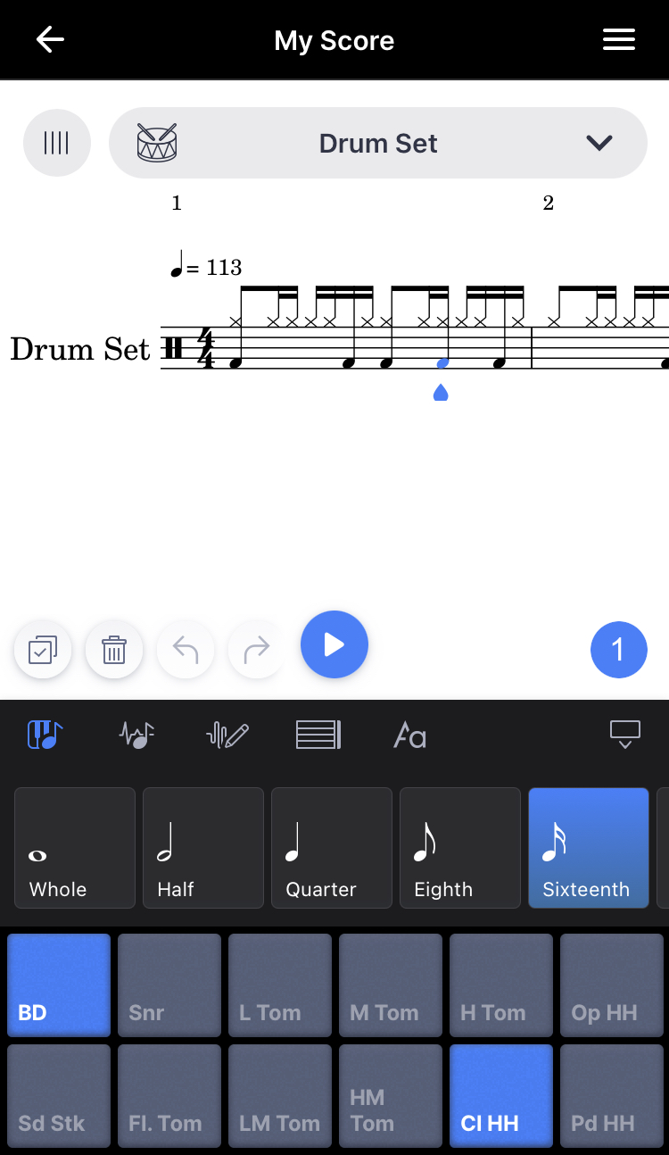
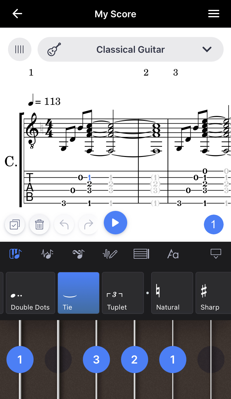

Figure 3—Left: The current drum set interface. Middle: the current guitar tablature note input interface. Right: selecting a fret using the guitar tablature interface requires that the user taps and drags one of the virtual strings.
Lastly, as pointed out by interviewees during the interactive needfinding study, the visual representation used by the guitar tablature interface is not good.
Firstly, the strings and fretboard are displayed vertically, which doesn’t make sense to most guitarists, who hold guitars horizontally. Also many guitars have 22 – 24 total frets, and in Flat, strings must be tapped and dragged vertically, which means it takes several scrolling movements to select higher fret numbers. Thirdly, even the actual tablature staff in the score is displayed horizontally. Finally, the guitar interface doesn’t update to reflect the number of strings of the instrument it is editing. In other words, if the instrument being edited is a ukulele or a four-string electric bass, there will still be six strings in the interface and it is not clear which of the displayed strings are the extra ones.
7 INTERFACE REDESIGN
To better represent how the redesigned note input interface works, an interactive prototype was created using the interface design web application, Figma. To see it in action, please click the following link: Flat.io Redesign. Note: image degradation within the prototype may occur based on your internet download speeds. This is normal. Also, the redesigned Flat note input interface for piano, drum set, and guitar are each accessible in separate prototype pages named Flow 1 Piano, Flow 2 Drums, and Flow 3 Guitar, respectively. The new keyboard toggle button and blue left/right buttons are functional in Flow 1 only, and notes can be added by tapping directly on the first three rests in the treble clef staff only when the virtual piano keyboard is minimized. Please see appendix 12 for more expanded screenshots from the prototype.
Figure 5—Screenshots from the prototype. Left: the default state of the redesigned note input interface. Middle left: piano view expanded. Middle right: drum interface. Right: guitar tab interface.

Figure 6—Button added for minimizing/expanding keyboard.
In this redesign, notes can now be added to the score by tapping directly on a note or rest in a staff to select it, and tapping again to place a note. Notes can also be directly dragged vertically to change their pitch. Two blue left/right arrow buttons have been added to the right side of the screen and move the blue teardrop cursor to the previous/next note in the staff. Two more light gray buttons have also been added next to the blue arrow buttons, and will move selected notes up or down by step on the staff.
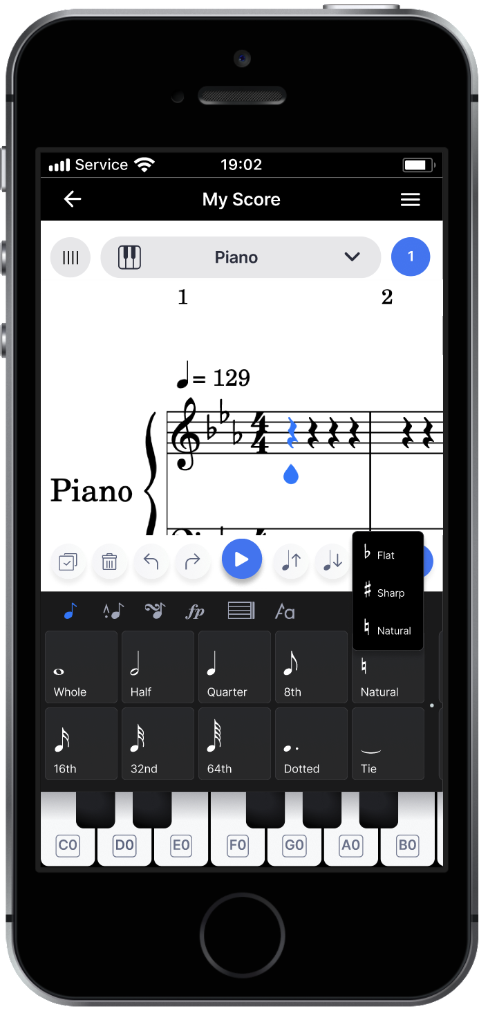
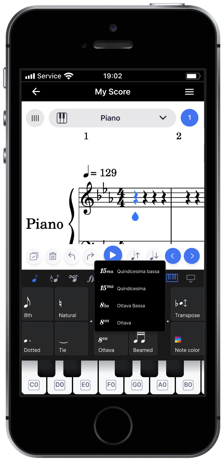
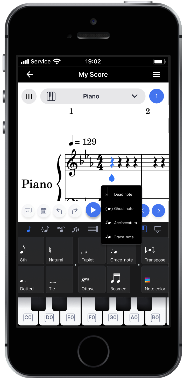
Figure 7—Bottom: the redesigned layout of note input function buttons. Top: some buttons can now display submenu overlays.
Now that there is more than one way to input notes, a keyboard icon that expands/minimizes the virtual keyboard has been added to the navbar under the score. The function buttons are now arranged into two much shorter rows, and the ‘Natural,’ ‘Ottava,’ and ‘Grace-note’ buttons reveal submenu overlays with similar functions when tapped. Finally, the keyboard, and drum pads take up less screen real estate, while providing access to a slightly wider range of notes, and the guitar representation was made horizontal. Frets notes are toggled by tapping on a fret for a specific string, and tapping on another fret on the same string will override the previous selection. Tapping on a blue fret marker will erase the note in the tablature staff.
8 INTERFACE JUSTIFICATION
The redesigned version of the note input interface offers considerably more flexibility in terms of inputting, editing, and selecting notes within the score. Tapping again on a selected note/rest at the desired vertical pitch within a staff gives users a second, intuitive option for entering notes. The original app allowed users to select a note by tapping on notes in the music score display, but it did not allow entering notes this way. Secondly, instead of only being able to change pitches of notes by toggling them with the virtual keyboard, the redesigned interface gives users two more alternative methods which include the two new gray note up/down buttons that more precisely transpose selected notes, and directly dragging a note vertically in the score. Third, the two new blue left/right buttons provide an alternate, more precise way of selecting notes.
These added features also provide users more ease and comfort when editing their scores. Requiring precise movement on the part of the user is often unsatisfying for them, so the two pairs of blue and light gray buttons provide an easier means for precisely selecting notes, and editing note pitches. Also, they were purposely placed to the right of the large ‘Play’ button so that the ‘Trash’ button would not be pressed accidentally. Another noticeable change was the shortening of the horizontal width of the row of square function buttons in the note input interface, which makes it easier to access the note interface’s many note input functions. The added sub menu functionality for some of the buttons allows for easier access to the more commonly used ones, and the new layout also makes scrolling from one end to the other practically instantaneous.
Entering notes by tapping directly on the staff not only provides extra flexibility, but also, more immersion for users, and they shouldn’t need to think so much in order to enter a note. This implementation of direct manipulation allows users to place notes exactly where they expect them to be placed.
The previous note articulation icon in the original interface was confusing so the new icon features an eighth note symbol with a more commonly understood note articulation symbol. Also, the ‘Toggle Concert Pitch,’ ‘Insert Mode,’ and ‘Change duration mode: Replace,’ buttons were all removed as their functions were extremely uncommon, and the width of these buttons were simply too wide.
The new horizontal layout of the guitar interface in the redesign provides a representation of a guitar fretboard that is much easier for guitarists to understand. Many other guitar learning apps often represent the fretboard from this perspective, so choosing a similar representation should come across as more familiar. As a bonus, it also provides greater access to frets on different strings, which makes it easier to enter specific chord shapes in turn.
8.1 Preserving Strengths
Overall, the redesign goes to great lengths to preserve the strengths of the original design. In terms of consistency, all added features follow the same visual design as the Flat mobile app, and use similar iconography from other previously released music software programs. The two blue arrow buttons are the same shape and color as the note selection cursor and the play button. This makes them appear related in functionality, which they are. The same is true for the two, light gray note up and down buttons, which feature simple quarter note symbols with an arrow pointing up or down. These are symbols that are found in other music notation apps, and infer that the note will be moved up or down in pitch in some way.
The simplicity of the original design, which was praised by many online reviewers, was somewhat trickier to preserve. With the addition of new features and buttons next to the play button, there was a risk that the additions would further clutter the overall interface. However, this was mitigated by carefully aligning the new buttons with the items in the navbar below, and strictly following the alignment rules used in the original app.
The other strengths of the original interface, which included tolerance, structure, and feedback, were practically undisturbed in this new redesign. The undo and redo buttons that increased tolerance in the original design were completely untouched. The same can be said regarding the excellent audio feedback. Also, the overall structure of clearly delineated sections for displaying the score, the function navbar, and the note input interface area, was explicitly maintained. Some of the note input interfaces for specific instruments risked increasing the height of the note input interface area too much, covering up the music score display window. Reorganizing the function buttons row into two rows, added to this risk. However, the overall sizings of buttons within each of the instrument interfaces were resized slightly to prevent this as much as possible.
9 EVALUATION PLAN
9.1 Evaluation Plan Selection
Because the redesigned interface introduces layout changes as well as new features like the blue left and right buttons, gray note up and down buttons, and tapping/dragging notes directly within the score window, qualitative evaluation in the form of interviews will be performed. Post-event protocols will also be used so that users will be as unbiased as possible. This is discussed further later in this section.
9.2 Procedure
4 – 5 participants who are friends or family that have used the Flat smartphone app previously will be selected to be interviewed. I will recruit these participants via text, email, or in-person methods. The evaluation interviews will occur in a comfortable environment where there are a few distractions, likely in the interviewee’s home or study. Because friends or family who have used the Flat smartphone app before might be located far away, interview conversations will occur over the phone. All participants will be sent links to the online Figma prototype so they can interact with it either on their phones or within their browser. Participants will need to install the Figma app onto their phones if they wish to try the prototype on them. Note taking will occur while interviews are being done.
9.3 Content
Due to the nature of the Figma app, and the prototype therein, it will first be pointed out to interviewees that they might experience some lag and degradation in image quality, and that this is normal. Then, the interview will be progress the following order:
- Participants will begin by accessing the Flow 1 Piano prototype. They will then tap the added piano keyboard button in the navbar to expand and minimize the virtual keyboard.
- I will then point out the new layout of the function buttons, and show them how some reveal submenu overlays when tapped.
- Users will then be asked to use the blue left and right arrow buttons to and navigate horizontally across the notes in the treble clef staff, which contains a melody.
- I will then ask users to select the first rest in the melody staff, and tap it again so that it becomes a C note. After this, the participants will be asked to select the 2nd rest, and input a B, then select the 3rd rest, and input an A.
- Because the functionality couldn’t be programmed into the Figma prototype, I will briefly explain that in this redesign, tapping the light gray buttons next to blue ones moves up or down the selected note(s) by a step.
- I will then briefly point out that additionally, a selected note’s pitch can be changed by directly dragging it vertically.
- Users will then move on to view the Flow 2 Drum prototype in Figma, and I will point out that it is mostly nonfunctional.
- After viewing Flow 2, users will move on to view Flow 3 Guitar. It will be very briefly explained that they must select a location on the tablature staff and then tap a corresponding position on the new guitar interface.
After each step, I will ask participants for their thoughts on what I have pointed out to them, and for their level of satisfaction regarding each new change or feature. I will also ask users if they prefer the old or new design for steps 7 and 8, and why. Throughout each interview, I will be taking notes on users’ answers, and capture any other notable reactions. I will also take note of user actions or behaviors that might reveal flaws in my redesign, and/or reinforce it, such as mistakes, slips, or the lack thereof.
9.4 Potential Biases
Confirmation bias is possible for this evaluation, as I may want to only hear the positive things users say about my redesign. I will make sure to record both positive and negative comments on my redesign. Also, social desirability bias may also occur as these will be friends, family, or acquaintances. To mitigate this, I will aim to not explicitly state that this is my prototype, and try to record data as objectively as possible.
10 EVALUATION EXECUTION (Report results 2 PAGES)
10.1 Results
There were 4 total interviewees of widely differing backgrounds who took part in the qualitative evaluation study. All four used the smartphone version of Flat previously. All 4 users gave ‘satisfied’ to ‘very satisfied’ ratings regarding all 8 steps. Only Participant 3 expressed initial dissatisfaction when seeing the drum interface in step 7, and provided ideas for how it could be represented better. All participants stated they would prefer to use all of the added features rather than go back to the original version at the end of the interview. The guitar interface was considered a major improvement, and felt natural.
10.2 Analysis
Upon analysis of interview notes, the redesigned interface was a resounding improvement in all areas where the original design was weak.
10.3 Summary & Next Steps
Overall, the redesign was well liked by all four interviewees. There are not many improvements that could be made regarding the existing functionality that the added features provided. However, several users provided other improvements such as adding arrows to function buttons that had submenus, and one mentioned that the representation of the drum interface could be improved.
11 APPENDIX: ORIGINAL FLAT MOBILE APP INTERFACE
Figure 11.1—Original default view of note input interface.
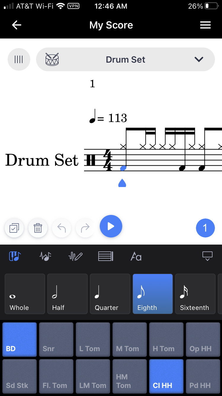
Figure 11.2—Original default view of drum input interface.

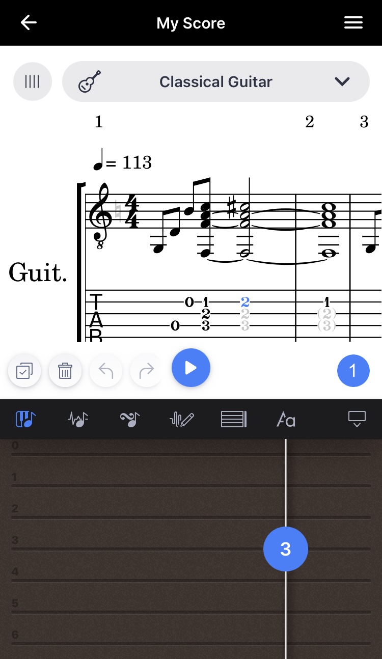
Figure 11.3—Original guitar tablature note input interface.
12 APPENDIX: REDESIGN
The Figma prototype can be accessed through this link: Flat.io Redesign
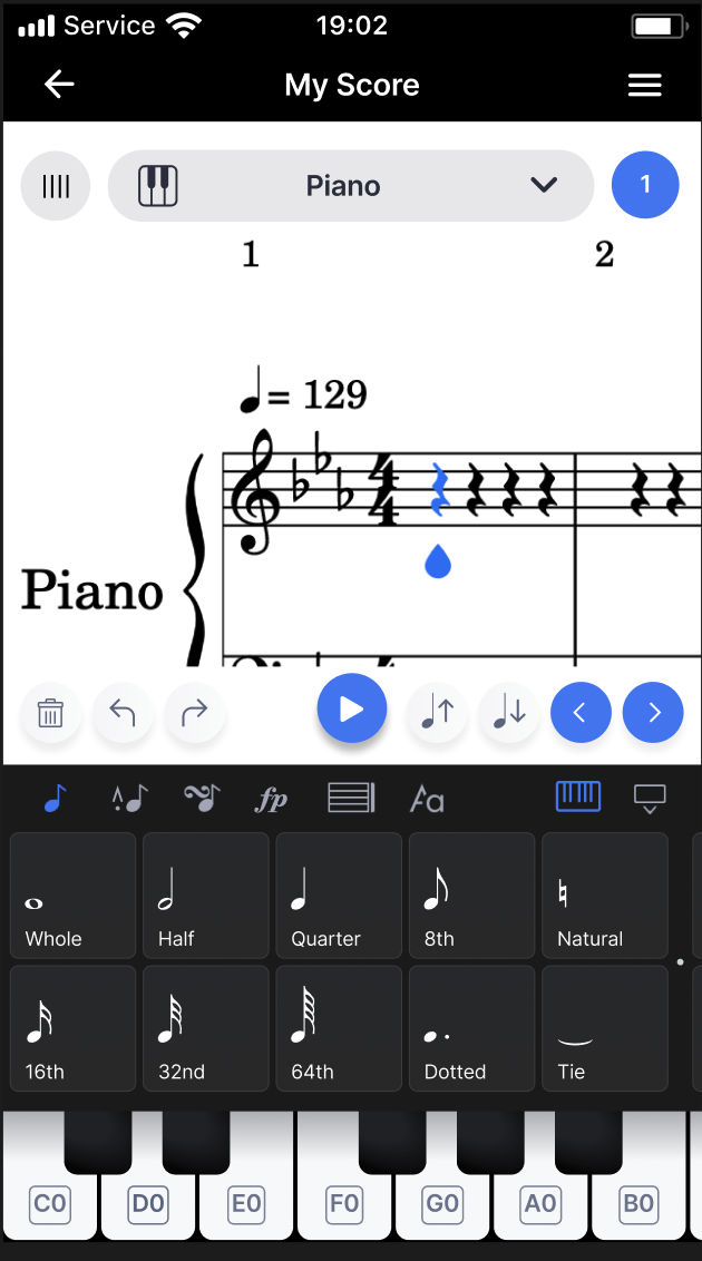
Figure 12.1—Redesigned interface with added blue toggle buttons, gray note up/down buttons, and updated function buttons layout.
Figure 12.2—Closeup of the added buttons, and updated navbar.
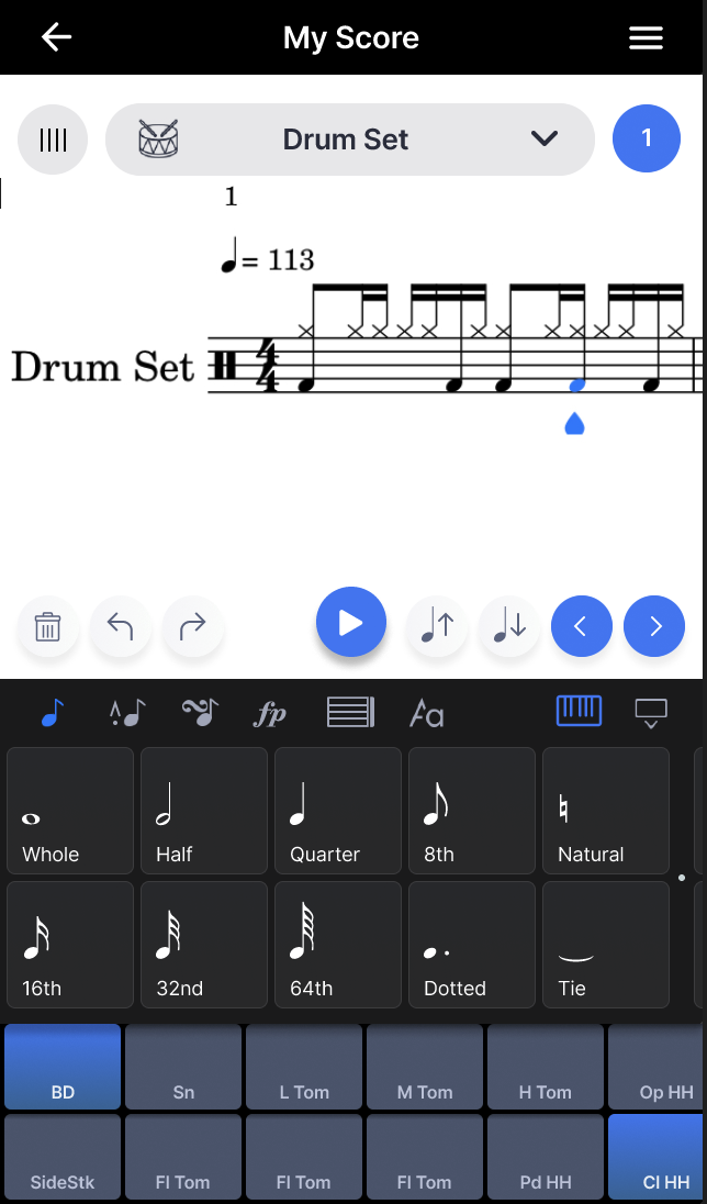
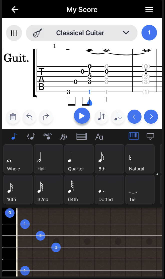
Figure 12.3—Updated drum note and guitar tab interfaces.
13 APPENDIX: QUALITATIVE EVALUATION RAW RESULTS
Participant 1 Interview Notes
Smartphone: iphone 13 reg
Regarding keyboard minimization/expansion
Step 1: Satisfying, it’s great to minimize/expand the keyboard, reveals more of the score
Step 2: Satisfying, button layout is much simpler and easier to navigate/find what you want
Step 3: Blue buttons are way more precise, makes it easier to input notes as well
Step 4: Intuitive, feels natural.
Step 5: Gray buttons “I like it. It’s more explicit to where insertion point is, which is nice.”
Step 6: Good added feature, might be kind of hard on smartphone, but should be ok with the gray note up/down buttons
Step 7: Way easier to add drums now with the blue buttons, maybe the gray ones could change the snare drum sound?
Step 8: That makes a lot more sense
Other features: Maybe add easier way to input chords
Participant 3 Interview Notes
Keyboard button
“Minimize, so I can play along as it plays”
[Explanation of keyboard]
Probably better than the other one, because you don’t have to scroll for forever”
Satisfaction
makes sense to me:
Like a quick toggle key
Tapping for sure, it feels like texting
I’m not gonna go to some toggle menu, I just want to tap where I want to be”
Because the tapping wasn’t working well, it was better in the other one
Adding a note with
“That was nice, I did like that”
Depends on what i’m using it for, it might be better using the piano
Just need to jot down these notes
I would tend to go with directly placing notes in the score
Gray button explanation
Gray buttons are a great idea, how to go back erase, [VERY SATISFYING]
maybe if i spent a lot more time, I might care about selecting multiple notes
Dragging , I’d prob,
It’s probably not necessary to have dragging, I’d just use the gray buttons
The gray buttons are more precise, I’d just tap it three times
Drums
Imagine that we all the functions are consistent still
This particlular thing would be much less useful, beccause I don’t know drum notation (tapping on the score)
Could it work? Tapping on the score,
The drum arrangement doesn’t work
Hi hat shouldn’t be so far to the right
Youdon’t use the toms so much
Here’s the drums here’s the cymbas
If it looked like a drumset that would make more sense
Their saving more space
Even if the pads were more of an arc” rainbow
Radial arrangement kick in the center
Drummer
Worse than the original, you felt like it could do more.
What things could you do more of?\
Which one do you prefer
Drummer looks better
The other one is better (less scrolling)
Guitar
I can tell I’m gonna like this better already”
I can just hold here, I can just hold and drag it horizontally
I gues becuz a guitar is held horis not vert
I don’t know what any of the nubmers mean, but all the 0s are o this top string. I would imagine
So it seems kind of intuitive if I’m right
First inclincation
Click on it and hit the garbage to delete a note
8 or 9 out of tien
I learned it really
The newer one is better overall
Toggle keys grew on me”
Ididn’t like em at first but I think they’re useful
The 4 keys are the best thing
What could be improved?
The abreves on the drum didn’t make sense
Would it be better with icons? maybe even a picture?
Depends on how good of a picture!
Also too, grace note submenus
I wish I had sub menus for the drum pads*
Bass snare (hold sub menu) hh, toms(), cymbals()
Holding down the notes in the score could reveal other drum types
Participant 4
minimize expand: I like that I can scroll “
But this way you cansee mre t
Its nice to have more of an option to toggle it
Hitting the buttons/sub menus
Checking sub menus
Satisfaction? It’s along the same lines, it seems like a intuitive nesting of features, where you can save some visual real estate , by grouping related things together
The other one didn’t have them in these popup
This is better for sure”
Two blue buttons
The left space back and forward
That’s nice” navigational buttons are definitely useful
You can top on the notes to navigate
It’s nice to have the o[tiopn of doing either
When one is faster when I want to go beat by beat
Its nice to be able to jump to a specific note, I like having both options
How do you feel about double tapping blue buttons to go to the next measure
“I like that idea , that would be nice”
Selecting the first rest
I feel i just double tappped on a rest and it added
It was nice
I like that .
Thats just kinda what i
I just did that not knowing that was going to happen
Which is good, so I just kinda tapped where the note should be, and then it was there.”
Gray buttons next to the blue
Definitely useful, similar to the navigation buttons
Lasso a chunk of notes? “drawing a circle. Feels the most natural”
Dragging a note vertically? I like that that’s nice
Anything that you don’t like? No
I’d say everything we’ve done , I either like or really like”
If you selected multiple with a circle, would you want vertical dragging
If I dragged a selected notes, i would like to drag vertically, and then tap elsewhere to deselect.
DRUMS
Imagine that all previousl funtions are in play, does it satisfy you?
I feel like it
I think drum notation is designed to be similar enogh, those navigation tools wiould still continue to be useful
I still like the navigation, all that stuff is still useful
What about
Not super comfortable with it,
I’m just such a midi, I ‘m a play it or hear it kinda guy, would play it in personally
I understand what that would
I woutld
I would prefer to play it live with the pads, hitting the snare
Being able to loop one or more measures, and layer recordings
Kick drums
Preferred way,
Do you see this as being the original way to use this app?
There is that one web based thing BandLab?
Mostl likely for me personally, its unlikely to come up as the way taht I would e doing stuff. Maybe that one real life example, not for drums, I have done guitar transcription stuff, and I have to transcribe stuff. If I was transcribing drum stuff for some reason, I could see myself using that” (drum stuff)
Guitar (flow3)
Tab interface
Does that make
I feel like tapping on the string and fret that you want to have fretted makes sense
Scrolling felt natural
How do yu feel about the smaller score,
I know it’s a prototype area, on this screen. You see the tablature and not the staff above it.
It might make more sense to omit the standard notation
The tablature for sure” the average non classical guitar player would use the tablature
You could have a notation toggle button for the score
Have the piano near the piano
Either
I like the changes that you made to the fretboard,
I saw the original which was confusing, and not intuitive
For a guitar player, this just looks a lot more sensible and familiar.
Easy to understand for the way a guitar player thinkgs about the instruments
Its’ similar to the way any other fretboards are respresented whenever you seee fretboard visualizations, or it’s in some ed materials like a guitar book, the representation is going to be much more simiilar to what you have in this version now.”
Gray buttons?
either it should move the selected note up or down a fret
Or transpose the chord*
That could maybe work,
I see that as a chromatic movement
OVERALL ADDITIONS
I think all of the changes you made are improvesments for sure
I thikn becuase of the nature of the instruments there are tricky aspecs ot fdrums and guitars
Partly becasee we are compromising with the instruments themselves and the unique forms of notation that they use
Wihtout making them use, other ways
Or for guitar .
I think given that, ti’s much moreintuitve than it was before
ooking back at all of the new additions,could you see yourself actually using this appfor putting down ideas
I could if there was a situation if I needed to do notation on myphone
I don’t know if I wwould choose to create music on my phone
With those. Features I ts the best way ive encountered to do that.
I’m much more likely to do garageband with the seq or drjm machine
If it was the knid of music that would make more sense to do notation
“Maybe orchestral stuff” but on myphone in garageband, wtht h ts that advantage of a full keyboard is lost. So it may it me be that doing notation could be better for that specificcallly. I havent tested that but it’s possible